I was standing in the checkout queue at Bunnings the other day when it hit me – why do I always feel so relaxed in here? Sure, the weekend sausage sizzle helps, but there's something else going on. Those signature green and red colours aren't just random choices. They're doing something to my brain, and I didn't even realise it.
That's the thing about colour psychology in marketing. It's happening all around us, every single day, and most of us are completely oblivious to it. Brands aren't just picking colours because they look nice together – they're strategically choosing hues that mess with our emotions and, ultimately, our wallets.
Here's where it gets a bit fascinating (and slightly unsettling). Our brains are hardwired to respond to colours in specific ways. It's not just cultural or personal preference – there's actual neuroscience at play. When we see certain colours, they trigger chemical reactions that influence our mood, energy levels, and even our decision-making processes.
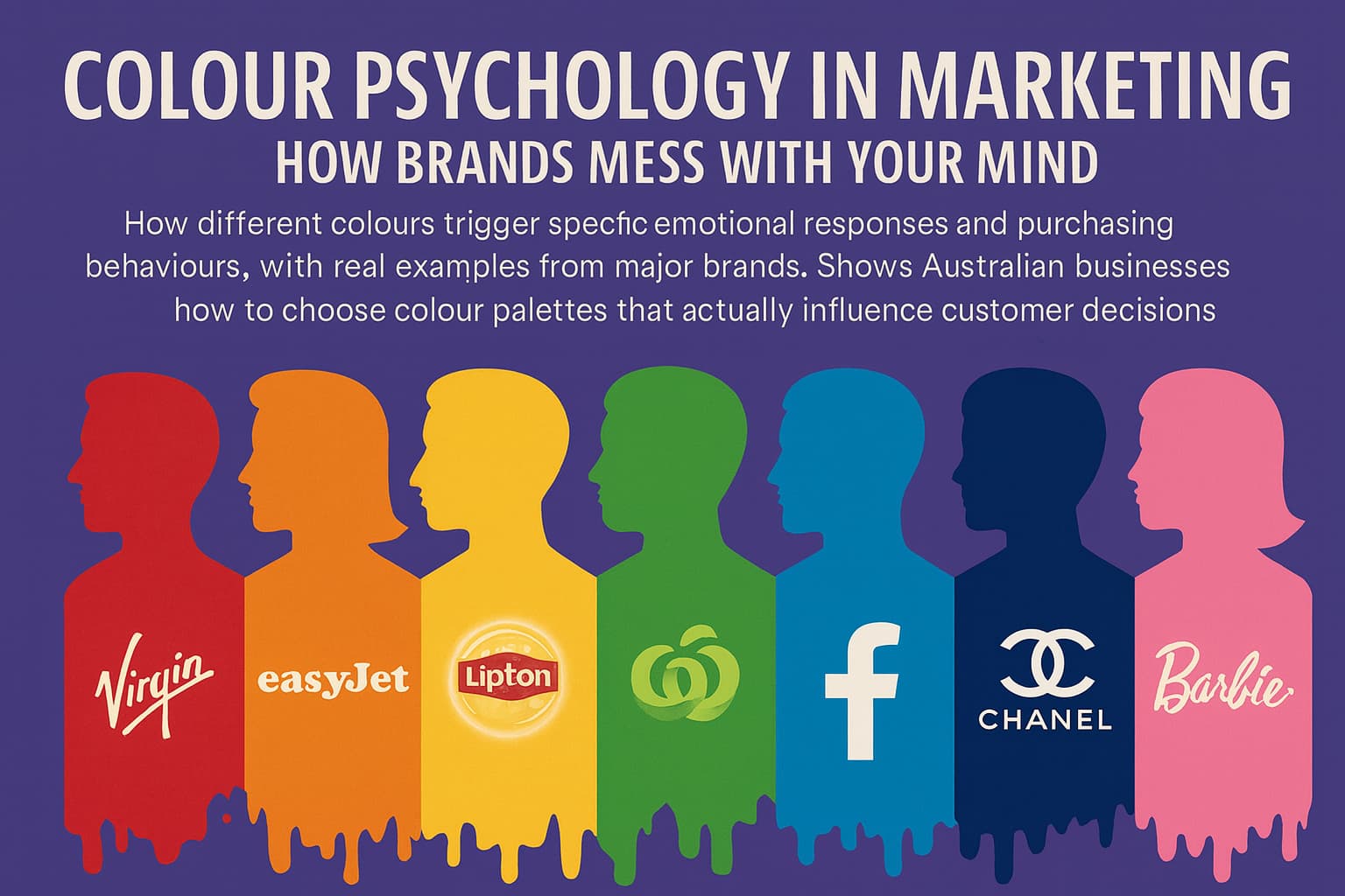
Red, for instance, literally increases our heart rate and creates a sense of urgency. Ever wonder why so many sale signs are red? It's not a coincidence. Your brain sees that crimson "SALE" banner and suddenly you feel like you need to act fast, even if the sale runs for another month.
Blue does the opposite – it's the colour of trust and reliability. Think about it: Facebook, LinkedIn, Twitter (well, when it was still Twitter), IBM, Ford. These brands want you to trust them with your data, your professional network, your money. So they wrap themselves in shades of blue like a corporate security blanket.
McDonald's golden arches paired with that specific shade of red? Pure genius, really. The red creates urgency (eat now!), while the yellow stimulates appetite and promotes feelings of happiness. I remember reading somewhere that these colours together can actually make you feel hungrier and more impulsive. No wonder I can never just drive past without at least considering a cheeky soft serve.
But here's where it gets interesting – different cultures respond to colours differently. In Australia, we might associate green with nature and health (hello, Woolworths), but in some parts of Asia, green can symbolise infidelity. This is why global brands often tweak their colour schemes for different markets. It's not just about translation – it's about emotional translation.
Not every brand nails their colour psychology from the start. Take Cadbury, for instance. That distinctive purple wasn't a marketing masterstroke initially – it was actually chosen because Queen Victoria's favourite colour was purple, and they wanted to honour her. But it accidentally worked brilliantly. Purple suggests luxury, creativity, and mystery. Perfect for chocolate that positions itself as a premium treat.
On the flip side, I've seen plenty of Australian businesses choose colours that work against them. A financial advisory firm using bright orange and yellow (too playful, not trustworthy enough), or a luxury spa going with harsh reds and blacks (more nightclub than relaxation sanctuary).
The thing is, you don't need a psychology degree to understand this stuff. But you do need to think beyond "what's my favourite colour?" when you're building your brand.
We've got our own colour psychology quirks here in Australia. Green and gold aren't just our national colours – they tap into something deeper. Green represents our vast landscapes, growth, and that laid-back connection to nature we're famous for. Gold speaks to prosperity, achievement, and perhaps a touch of that Aussie confidence.
Look at how Telstra uses blue (trust in telecommunications), or how Qantas combines red (energy, excitement about travel) with white (cleanliness, safety). These aren't accidents. Every major Australian brand has spent serious money figuring out what colours make us tick.
But here's what's really clever – some brands use colour psychology to stand out from their industry norms. ING's bright orange in the banking sector is a perfect example. While every other bank was using blue and grey to signal trust and stability, ING went orange to suggest energy, innovation, and approachability. Risky? Absolutely. Effective? Their customer numbers suggest yes.
This is where a lot of businesses get it wrong, especially smaller Australian companies. They think colour choice is just about aesthetics – making their logo look pretty or their website seem modern. But colour is a business tool, just like your pricing strategy or your customer service approach.
When you're choosing colours for your brand, you need to ask yourself: what do I want my customers to feel? Not what do I want them to think – what do I want them to feel? Because feelings drive purchasing decisions far more than rational thoughts do.
If you're a health food company, you probably want people to feel natural, fresh, energised. Green's your friend. Running a luxury service business? Deep blues, purples, maybe some gold accents to suggest premium quality and exclusivity.
But here's the tricky bit – context matters enormously. A bright red might work brilliantly for a gym (energy, motivation, action) but could be disastrous for a meditation centre (too stimulating, aggressive).
Individual colours are one thing, but how they work together is where the real magic happens. Ever notice how Spotify's green looks so modern and fresh? It's partly because they pair it with black and white – the green pops without being overwhelming, while the black adds sophistication.
McDonald's red and yellow combination creates appetite and urgency, but imagine if they'd gone with red and purple instead. Suddenly you're in vampire territory rather than family-friendly fast food.
The proportion matters too. A tiny hint of red in a predominantly blue colour scheme can add just enough energy without compromising trust. But flip those proportions and you've got a completely different emotional message.
So how do you actually apply this stuff without ending up looking like a children's toy store or a corporate law firm (unless that's what you're going for)?
Start with your customers, not your personal preferences. I can't tell you how many times I've seen business owners choose colours because "I've always loved purple" rather than thinking about whether purple serves their business goals.
Think about the customer journey too. Maybe you want calming blues on your website to build trust, but energising orange in your call-to-action buttons to encourage clicks. Different parts of your brand can use different colours strategically.
And please, test things with real people. Your mate Dave's opinion over a beer doesn't count as market research. Show your colour choices to actual potential customers and pay attention to their gut reactions, not just their rational explanations.
Here's something that keeps me up at night (in a good way) – colour psychology is evolving as our digital world changes. The colours that work on a phone screen might not work the same way in print. The colours that appeal to Gen Z might completely miss the mark with Baby Boomers shopping for the same product.
Plus, we're seeing more brands playing with colour psychology in sophisticated ways. Netflix changes the colours of their movie thumbnails based on what they think you'll respond to. If their algorithm thinks you prefer comedies, you might see more orange and yellow thumbnails. If you're into thrillers, expect more dark blues and reds.
The brands that understand this psychological toolkit aren't just picking pretty colours – they're crafting emotional experiences that guide customer behaviour in incredibly subtle ways.
Your logo might be small, but the psychology behind its colours is working 24/7, influencing how people feel about your business before they even know what you do. That's either terrifying or exciting, depending on how you look at it.
I reckon it's pretty exciting. After all, if you're going to mess with people's minds, you might as well do it in a way that helps both of you get what you want.


.jpg)
.jpg)
%20(1).jpg)