I was scrolling through Instagram the other day when something caught my eye - two Melbourne cafes, literally next door to each other, with completely different approaches to their signage. One had this gorgeous, flowing serif font that screamed "artisanal sourdough and $7 coffees", while the other went full minimalist with clean sans serif lettering that practically shouted "quick grab-and-go efficiency".
Both were packed. But here's the thing - they were attracting completely different crowds.
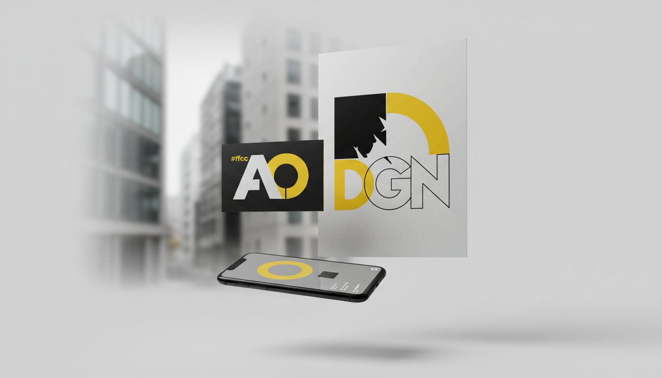
This got me thinking about something I see Australian businesses wrestling with all the time: serif vs sans serif fonts. It's one of those decisions that seems simple on the surface but can actually make or break how your brand connects with your audience.
Let's be honest - fonts have personalities. And just like people, some personalities click while others... well, don't.
Serif fonts are the ones with those little decorative strokes (the "feet") at the end of each letter. Think Times New Roman, but hopefully something more interesting. They've got this inherent sense of tradition, reliability, and sophistication. There's something almost comforting about them - like your grandmother's handwritten recipe cards or the masthead of a quality newspaper.
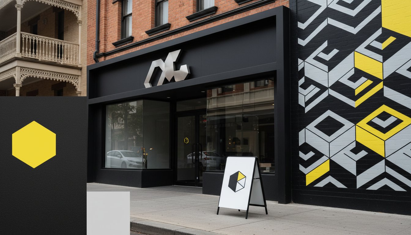
Sans serif fonts, on the other hand, have ditched those decorative bits entirely. Clean, modern, no-fuss. They're the Marie Kondo of the typography world - they spark joy through simplicity.
Here's where it gets interesting for Australian businesses. Our market has some pretty specific characteristics that influence which approach works better.
Serif fonts tend to work brilliantly for:
I remember working with a boutique accounting firm in Ballarat who was struggling to attract the right clientele. They'd been using this modern sans serif font that made them look like a tech startup. The moment we switched to a sophisticated serif typeface, their enquiries from established business owners doubled. Sometimes tradition sells itself.
Sans serif is often the hero for:
The thing about sans serif fonts is they work incredibly well in our digital-first world. They're easier to read on screens, they scale beautifully from business cards to billboards, and they just feel more accessible somehow.
This gets a bit tricky, but Australian businesses have to navigate something unique - we're caught between respecting tradition and embracing innovation. We love our heritage, but we're also incredibly forward-thinking.
Take our banking sector, for example. The big four banks have all gradually shifted towards cleaner, more modern typography over the past decade. They're trying to shake off that stuffy, intimidating image while still maintaining trust and authority. It's a delicate balance, and honestly, some have pulled it off better than others.
Then there's our startup scene, particularly in Melbourne and Sydney, where sans serif dominates. But here's what's fascinating - even tech companies are starting to experiment with more distinctive serif fonts to stand out in an increasingly crowded market.
Have you ever noticed how some of the smartest brands don't pick sides at all? They use both.
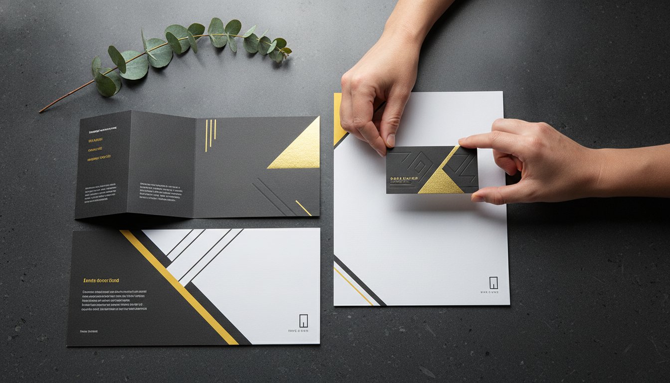
A serif for their main logo or headlines (personality and authority) paired with sans serif for body text (readability and modernity). It's like having the best of both worlds - the gravitas of tradition with the accessibility of contemporary design.
I've seen this work particularly well for Australian professional services firms who need to appear both established and approachable. Your logo might be in an elegant serif that speaks to decades of experience, while your website copy uses a clean sans serif that's easy to digest on mobile devices.
So how do you actually choose? Start by asking yourself a few questions:
Who are you trying to attract? If your ideal client is someone who values tradition, craftsmanship, or prestige, serif fonts might be your friend. If you're after a younger, more tech-savvy demographic, sans serif could be the way to go.
What industry are you in? Some sectors have unspoken typography traditions. Fighting against them isn't impossible, but you need to be strategic about it.
Where will your typography live? If you're primarily digital, sans serif often performs better. If you're doing a lot of print work or traditional advertising, serif fonts can really shine.
Here's what I've learned after years of working with Australian businesses: there's no universal right answer. The best typography choice is the one that authentically represents your brand while connecting with your specific audience.
But here's a tip - don't overthink it to the point of paralysis. Sometimes the "wrong" font executed with confidence works better than the "right" font applied half-heartedly.
The key is understanding that business typography in Australia isn't just about looking good (though that certainly helps). It's about communication, connection, and ultimately, conversion.
Whether you go serif, sans serif, or something in between, make sure it's a deliberate choice that supports your bigger brand story. Because at the end of the day, your font is often the first thing people notice about your business - even if they don't consciously realise it.
Struggling to find the right typographic voice for your Australian business? We'd love to help you navigate the serif vs sans serif decision (and everything else that goes into creating a brand that actually works). Get in touch with us to start the conversation about your brand's typography needs.


.jpg)
.jpg)
%20(1).jpg)