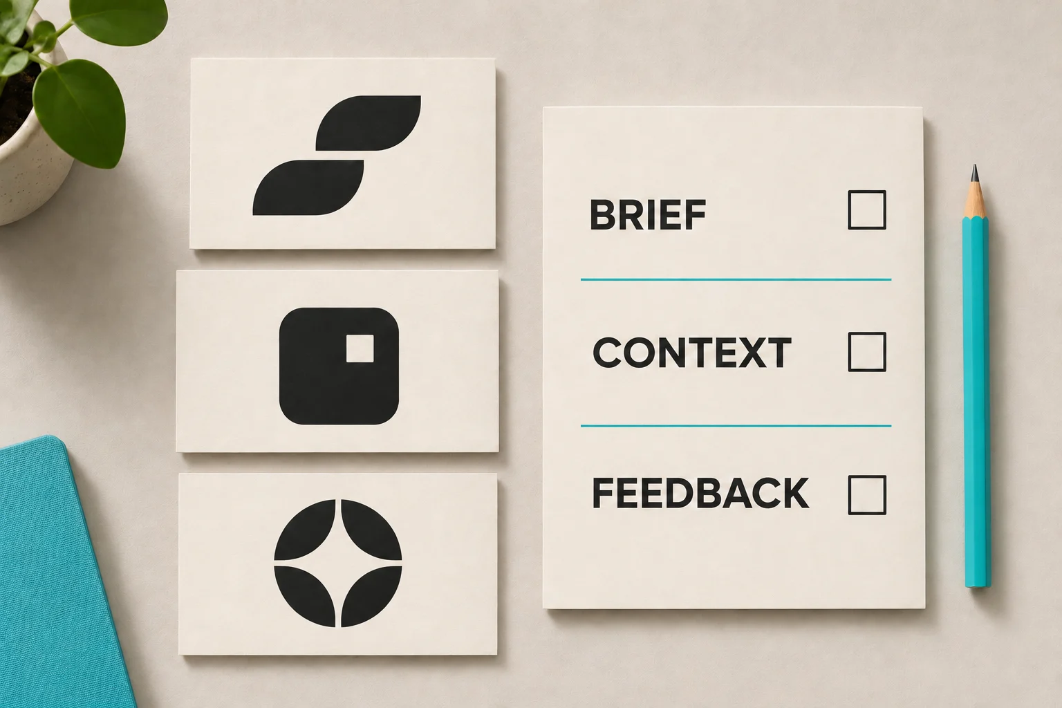
A logo presentation can quickly turn into a discussion about favourite colours. A more useful question is whether each concept answers the brief: who the organisation needs to reach, what it needs to communicate and where the identity will be used.
This guide gives a project team a practical way to compare concepts and return clear feedback. It is especially useful when several people need to contribute, but one person must bring their comments together.
Keep the approved brief beside the presentation. Pull out a short list of criteria that matter to the project, rather than trying to assess every possible quality of a logo.
Make broad words more specific. If the brief says “approachable”, discuss what that means for your audience. A community service, a school and a professional practice may need different expressions of that idea. If the brief has changed since the designer began, raise that before evaluating the concepts against new expectations.
Ask the designer to explain how each direction relates to the brief. What is the central idea? Why were the type, shape and colour chosen? How could the identity work beyond the logo itself?
Then consider what is apparent without that explanation. The presentation should help you understand the choices, but people encountering the finished identity will not usually hear the full design rationale. Separate an interesting story from what the visual design actually communicates.
Record both strengths and concerns for each concept. “The open lettering feels welcoming, but the organisation's name is difficult to read at this size” gives the designer more to work with than “I don't like the font”.
A dramatic mock-up can make one option feel more convincing than another. Ask to see the directions in comparable applications, using similar content and scale. Start with the ordinary things your team will use, not just a striking wall sign.
For a professional practice, that might be a proposal cover, a website header and a presentation slide. For a community organisation, a programme flyer and an everyday document may be more relevant. These are examples to choose from, not a requirement to commission every application.
Look at the logo on a plain background as well as in context. Check how the name reads, how the symbol and lettering relate, and whether the proposed identity feels coherent across the selected applications.
Review examples at the size people will actually see. A logo that looks clear across a large screen may need a different arrangement in a narrow website header or a small document footer.
Ask how the concept would work on light and dark backgrounds and, where needed, in one colour. If embroidery, signage, partner logos or a long organisation name are important to the project, bring those requirements into the discussion now.
Concept examples are not necessarily finished production artwork. Ask which practical checks have been completed and which belong to the next stage. Do not treat a polished mock-up as confirmation that every format or manufacturing requirement has been resolved.
A concern about the central idea is different from a request to adjust spacing. Try to identify which kind of feedback you are giving.
For each comment, describe what you observe, connect it to a requirement and ask the designer to consider the response. Avoid prescribing a mixture of elements from different concepts before discussing whether they belong together.
Give reviewers the same brief and presentation. Ask them to record their reasons, not only their preferred option. If people disagree, establish whether they are responding to different audiences, uses or assumptions.
Nominate someone to consolidate the comments. Remove duplicates, resolve contradictory instructions where possible and identify decisions that still need discussion. Keep personal preferences visible as preferences rather than presenting them as evidence about the audience.
A useful feedback note can follow this structure:
End the review by recording what has been agreed and what remains open. Selecting a concept for development is not the same as approving final artwork. Confirm the next stage, who will review it and which changes need to be shown again.
When the identity is ready for handover, agree the files and guidance your team and suppliers need. Our guide to choosing the right logo file explains the practical questions to ask before using or sending artwork.
If you are planning a new identity or reviewing an existing one, explore Seamer Design's branding services in Melbourne and Ballarat.