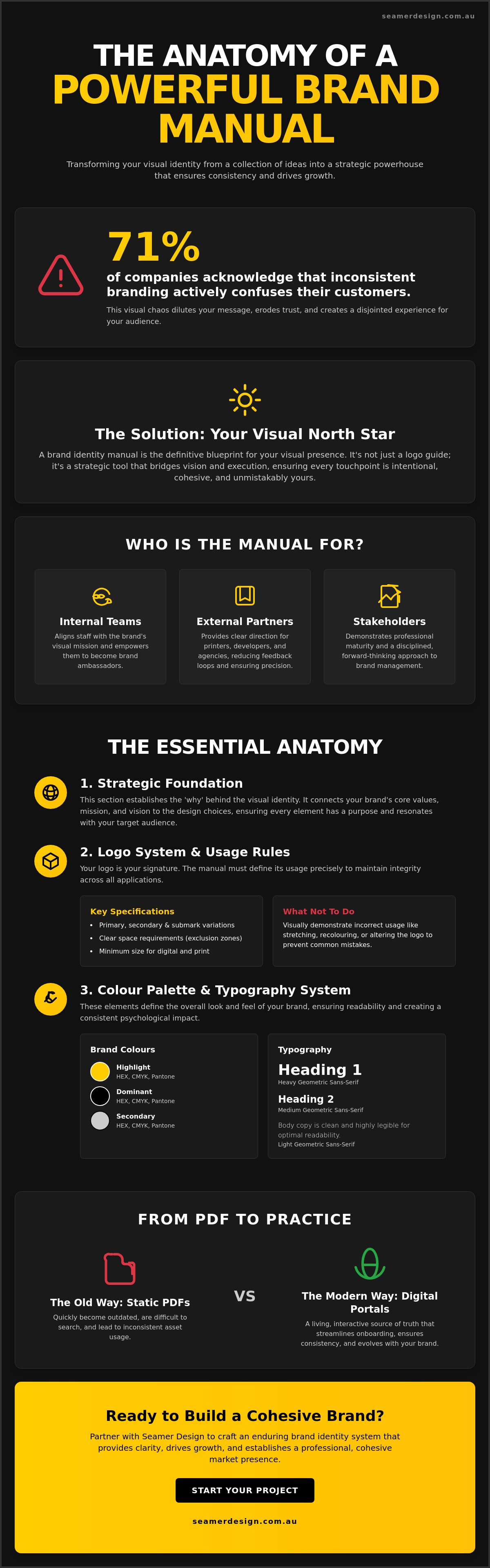
Did you know that 71% of companies acknowledge that inconsistent branding actively confuses their customers? It's a staggering figure that highlights the hidden cost of "making it up as you go." You've likely felt the frustration of seeing a mismatched social media post or spending hours explaining logo placement to a new contractor. It's exhausting. You want your brand to feel like a unified powerhouse, not a collection of disconnected ideas.
We believe your visual identity should be your greatest advocate. This guide shows you how to transform your visual assets into a strategic tool with a comprehensive brand identity manual built to scale with your business. You'll discover how to move beyond static documents to create a dynamic framework that empowers your team. We'll explore the essential components of a modern manual, from WCAG 2.2 accessibility standards for your brand colours to adaptive digital systems that ensure your market presence remains professional, cohesive, and unmistakably yours.
• Define your visual North Star. Understand why a functional brand identity manual is a strategic source of truth rather than just a logo guide.
• Master the essential anatomy. Learn how to build a sophisticated system that moves beyond basic assets to guide every visual touchpoint.
• Bridge strategy and aesthetics. Discover how to ground your design choices in core values to ensure your brand resonates with purpose.
• Modernise your implementation. Move away from static PDFs toward interactive digital portals that streamline onboarding and ensure consistency.
• Drive business growth. Explore a collaborative approach to brand strategy and visual identity design that builds a professional, cohesive market presence.
Think of your brand as a living entity. It speaks, it moves, and it interacts with your audience every single day. Without a central source of truth, that entity becomes fragmented. A brand identity manual is the definitive blueprint that ensures every expression of your business remains consistent, intentional, and powerful. It is far more than a simple document; it is a functional tool designed to protect your most valuable asset.
Many people use terms like style guide, brand book, or guidelines interchangeably, but subtle differences exist. A brand book often focuses on high-level philosophy and mission. A style guide might focus solely on typography and colour. In contrast, a comprehensive manual bridges the gap between vision and execution. It provides the technical specifications and strategic context required to maintain a professional Corporate Identity across every possible medium. For a Melbourne business operating in a saturated market, this manual is the difference between looking like a local start-up and presenting as an established industry leader.
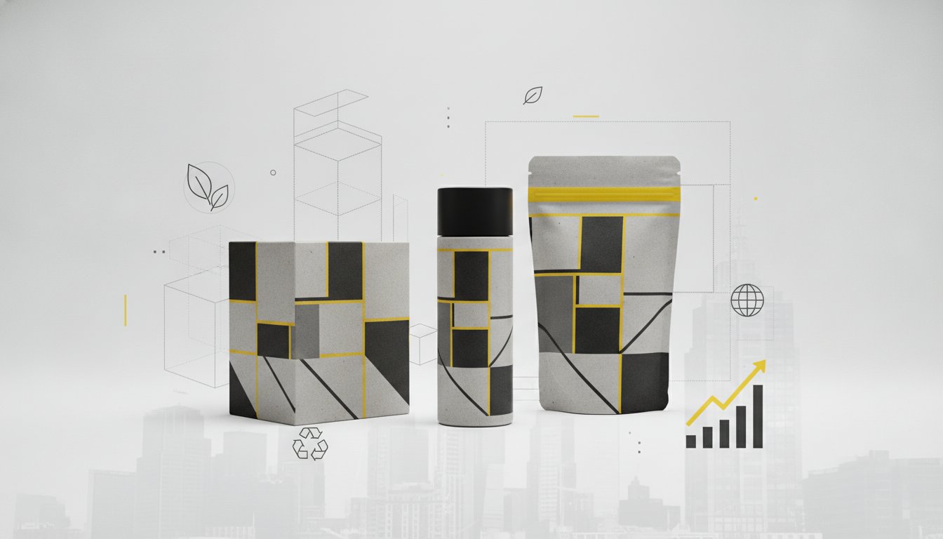
Consistency is the foundation of brand equity. When your environmental graphics match your website design and your packaging feels like an extension of your digital ads, you build a recognisable presence. This repetition creates a sense of reliability. Customers begin to trust what they can predict. A brand identity manual serves as the strategic anchor that allows your business to scale without losing its soul. It provides the rules for colour contrast, clear space, and grid systems, ensuring your brand never feels diluted or "off-brand," regardless of who is creating the content.
A well-crafted manual serves three distinct audiences, each with unique needs:
It aligns your staff with the brand's visual mission. It empowers employees to become brand ambassadors who understand the "why" behind the "what."
It provides clear, uncompromising direction for creative partners. Printers, web developers, and signage experts can execute their work with precision, reducing the need for endless feedback loops.
It demonstrates professional maturity. A comprehensive manual shows investors and board members that the organisation is disciplined, forward-thinking, and serious about its market position.
By defining these standards early, you stop reacting to design challenges and start leading with a cohesive strategy. You move from a state of visual chaos to a position of creative control.
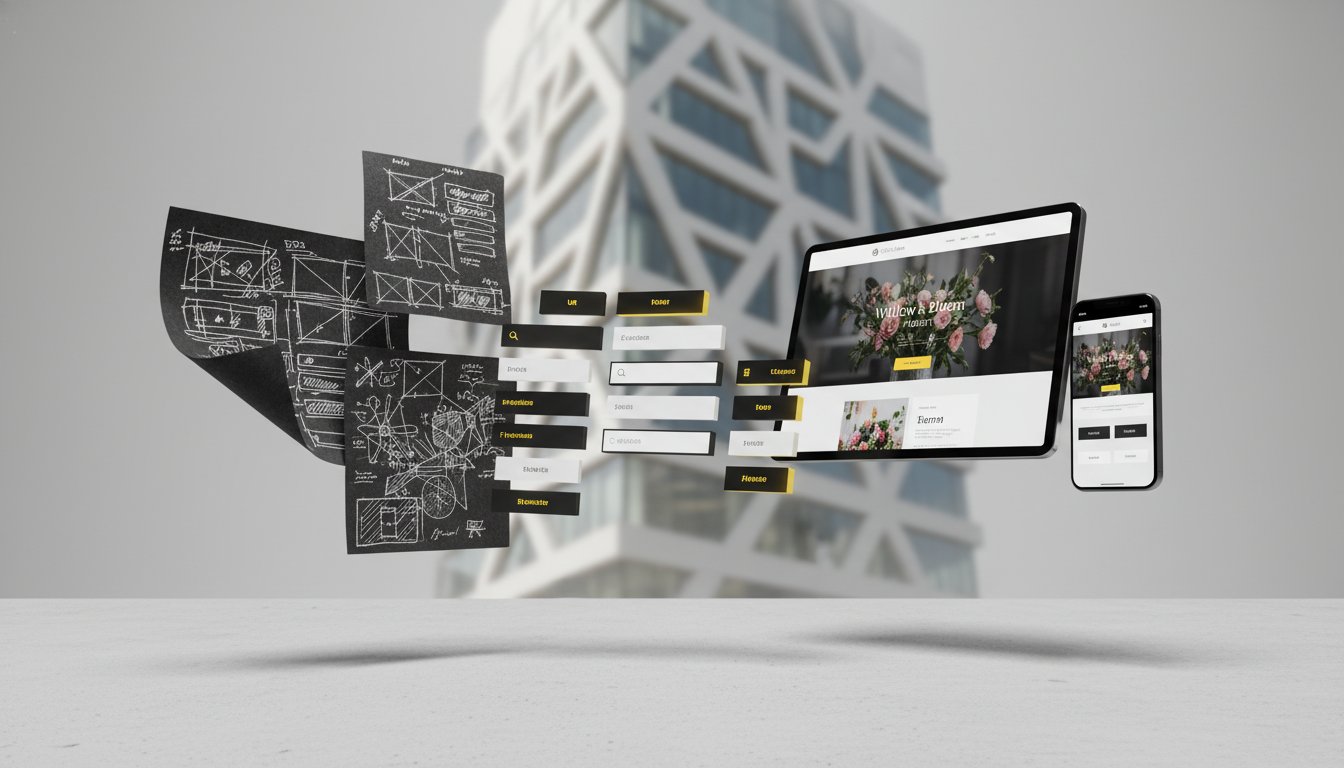
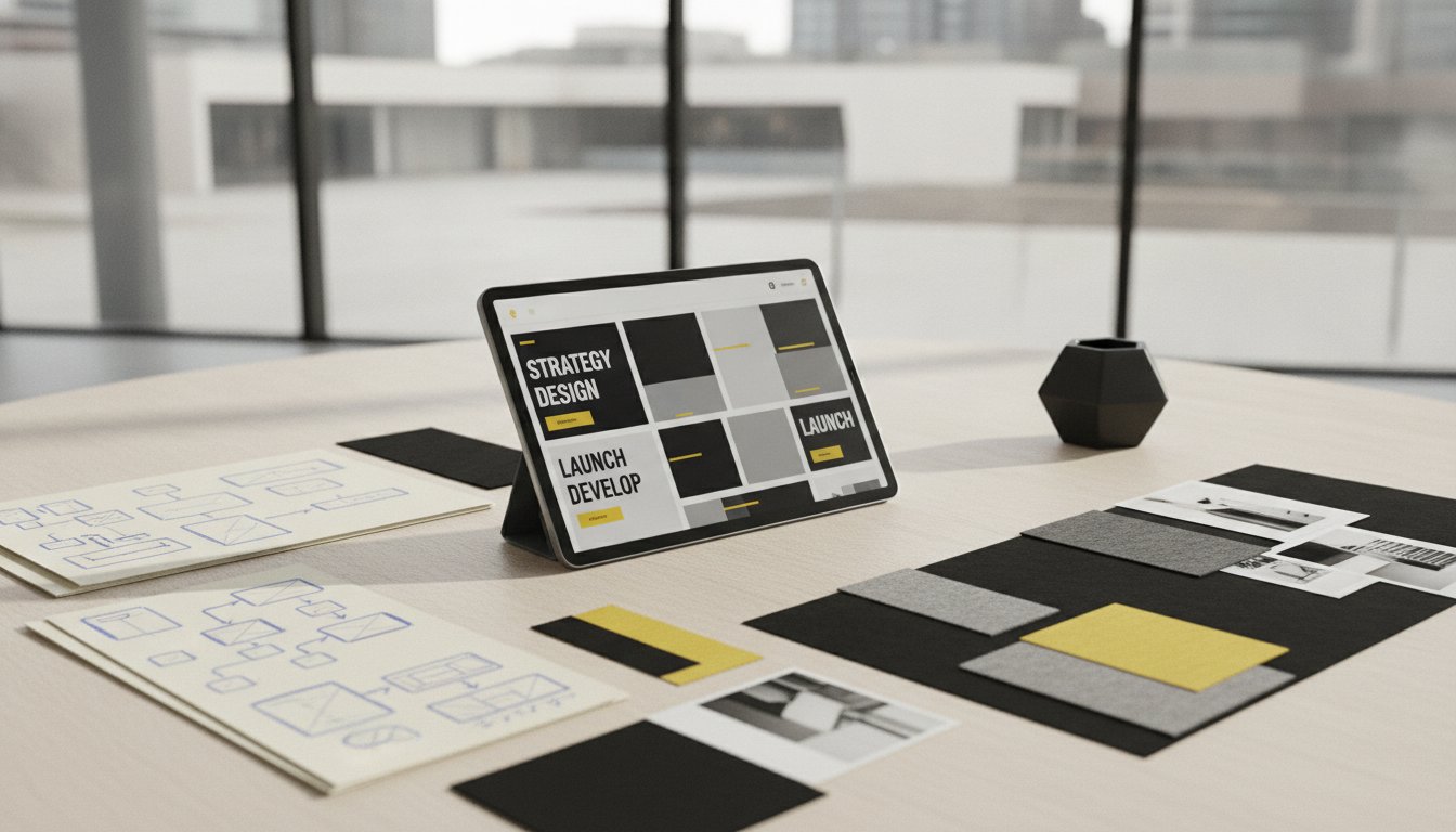
A robust brand identity manual acts as the skeletal structure for your business. It supports every creative decision and ensures the external face of your company remains steady as you grow. To achieve this, the document must move beyond mere logo placement. It needs to establish a sophisticated system where every element works in harmony. A great starting point for inspiration is the University of Michigan's brand guidelines, which demonstrate how complex systems are distilled into clear, actionable rules for diverse teams.
The manual should always begin with a strategic introduction. This section sets the tone; it explains the brand's vision and the "why" behind the visual choices. Without this context, the rules that follow can feel arbitrary. When creative partners understand the heart of the brand, they produce work that resonates more deeply with your audience.
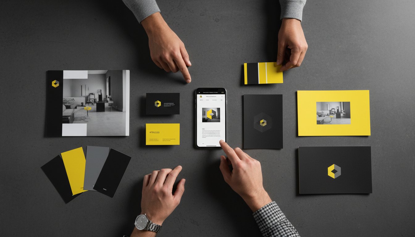
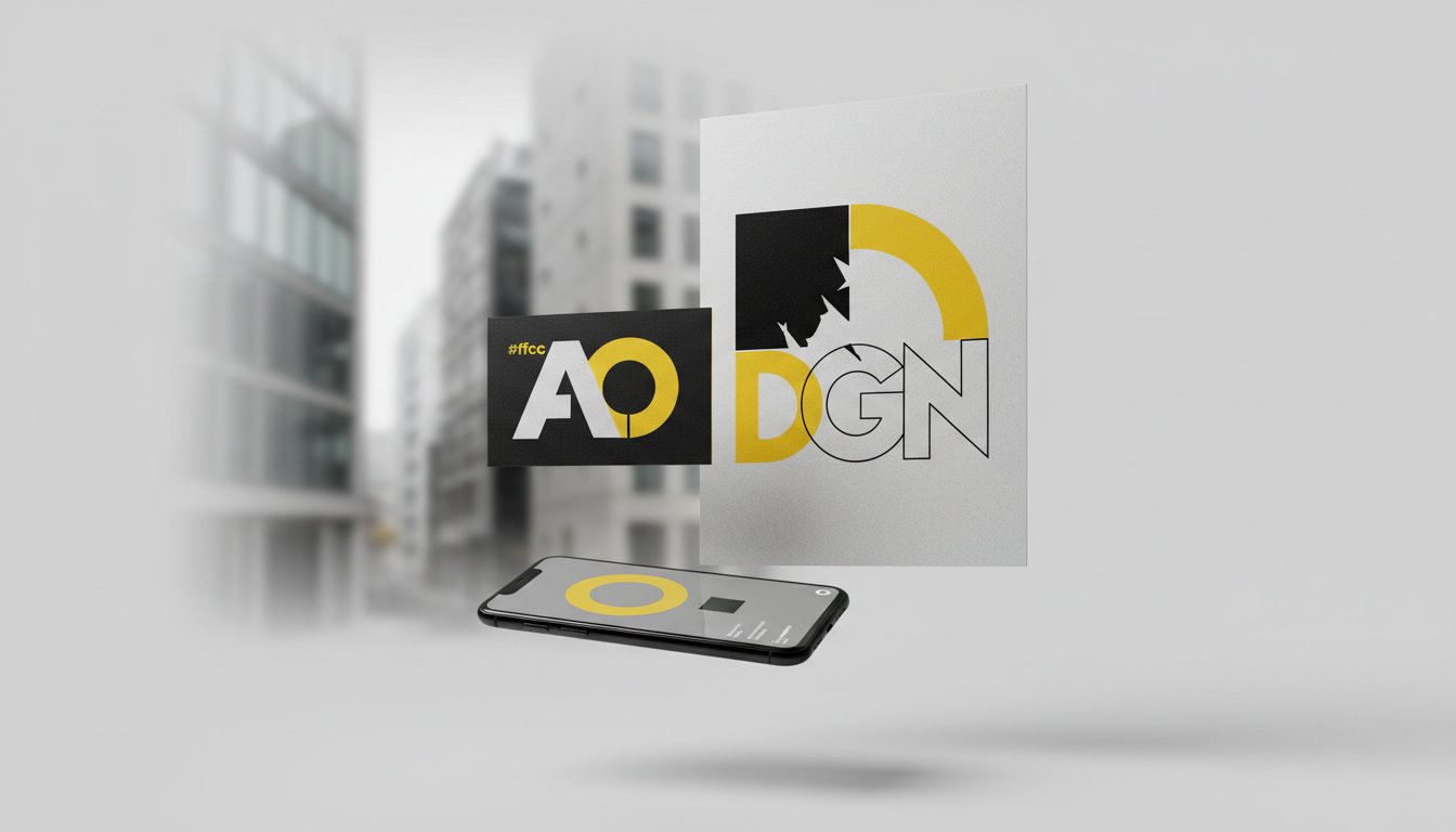
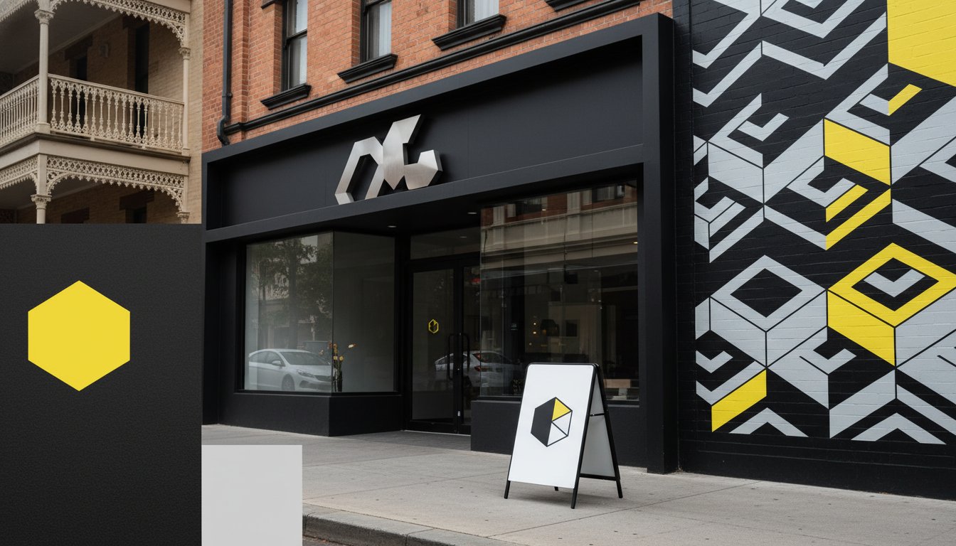
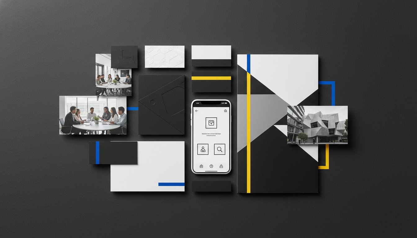
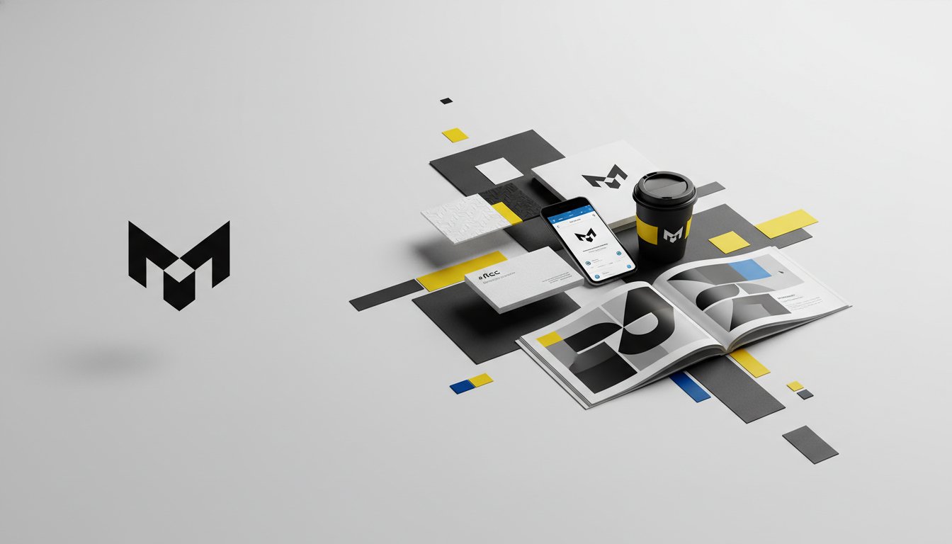
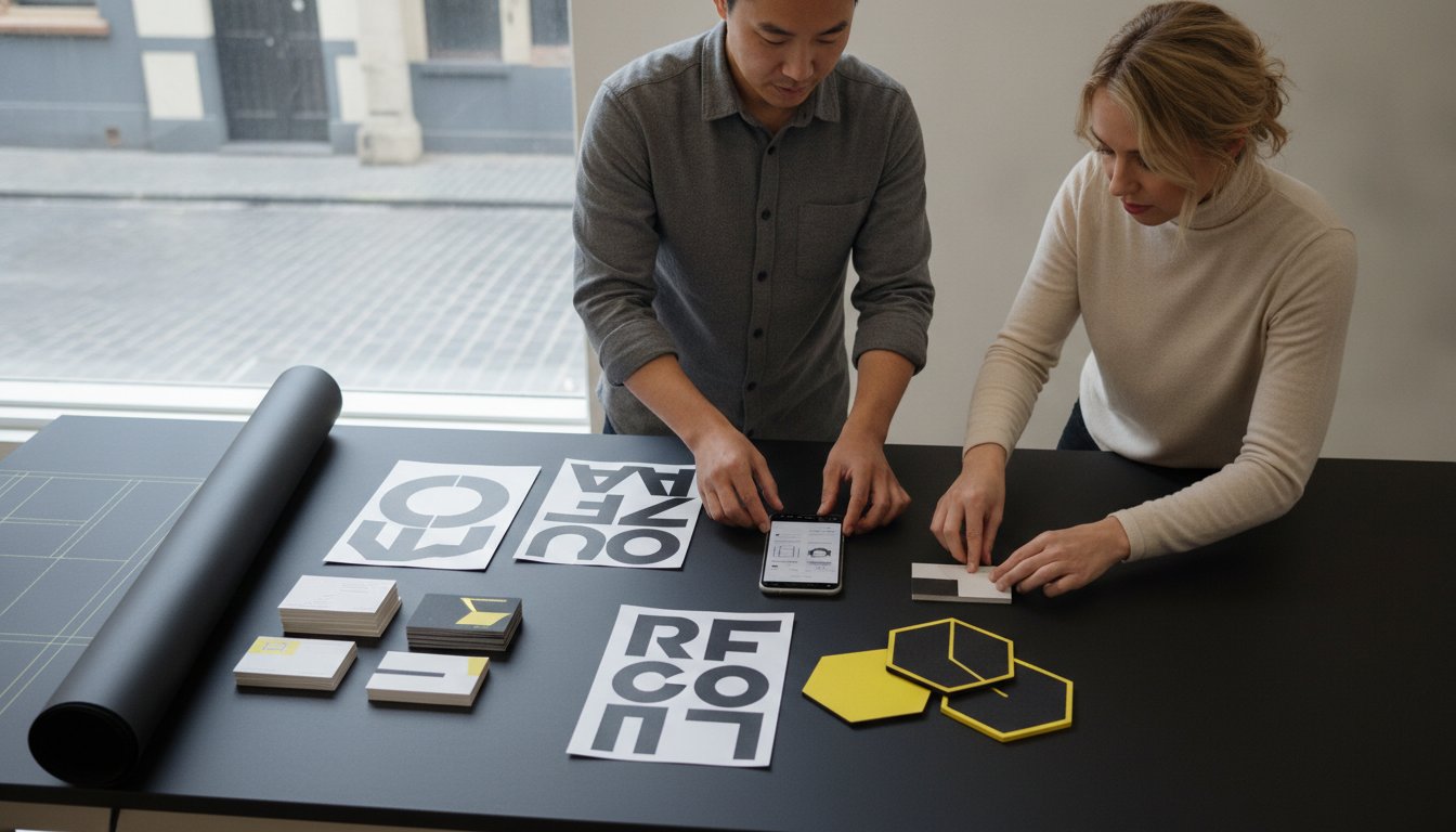
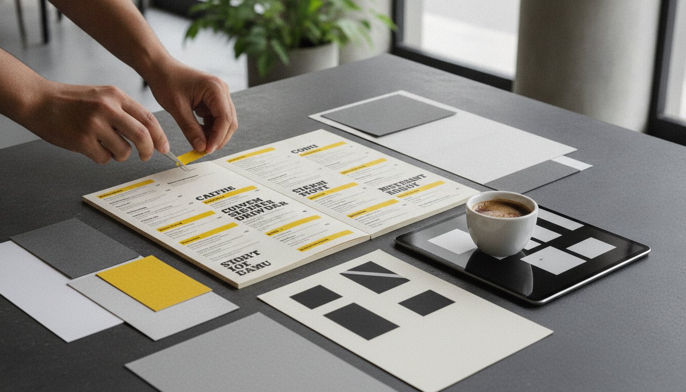
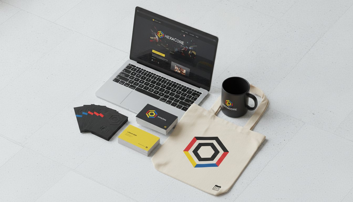
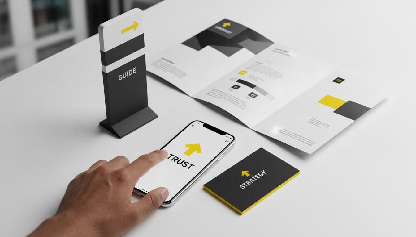
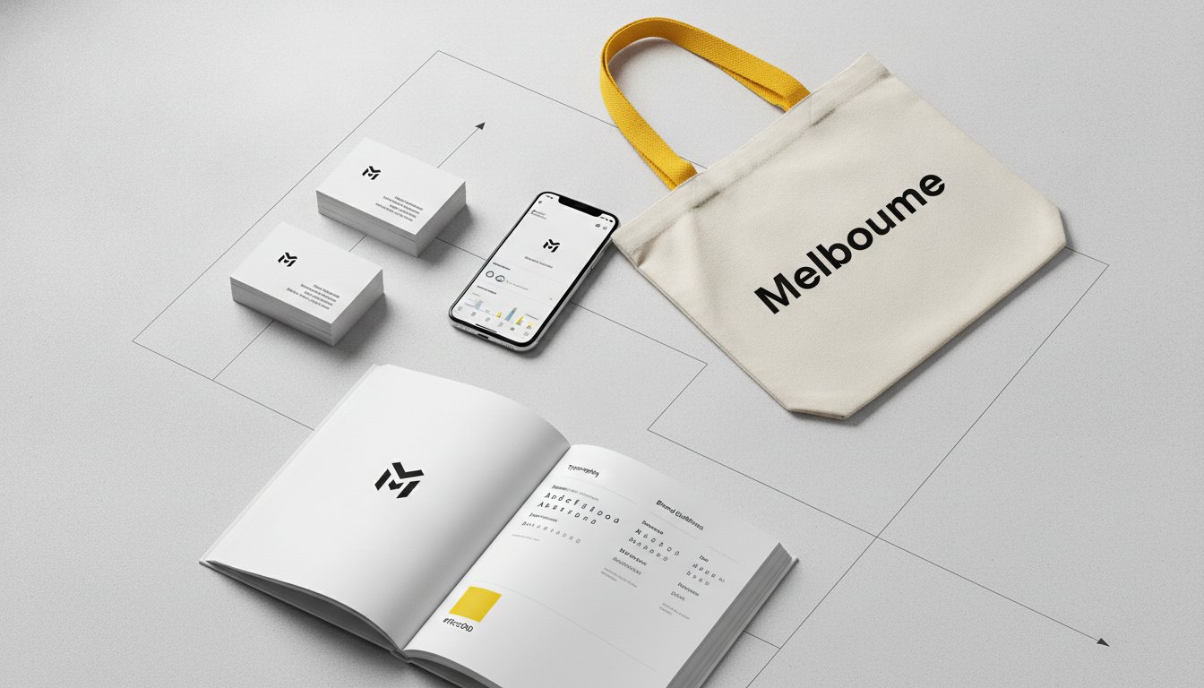
Your logo is your signature. To maintain its integrity, your manual must define primary, secondary, and submark variations. Primary logos are for hero placements, while submarks might suit social media avatars or small-scale print. Clear space requirements are non-negotiable. They protect the logo from being crowded by other elements. Minimum size constraints ensure legibility on everything from a business card to a billboard. We often include a "Never Do" page. This visual hall of shame shows exactly how not to stretch, recolour, or distort the mark.
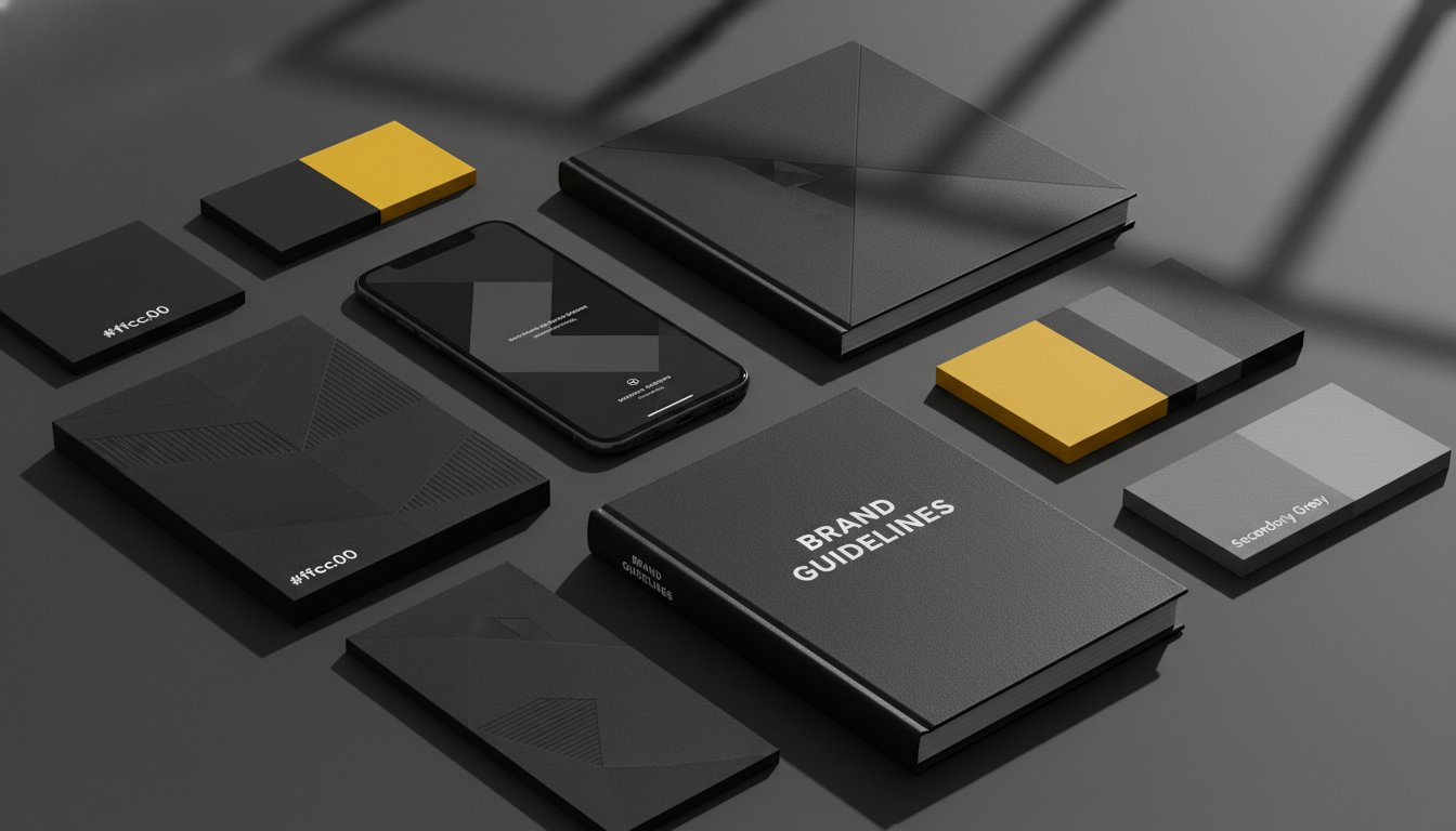
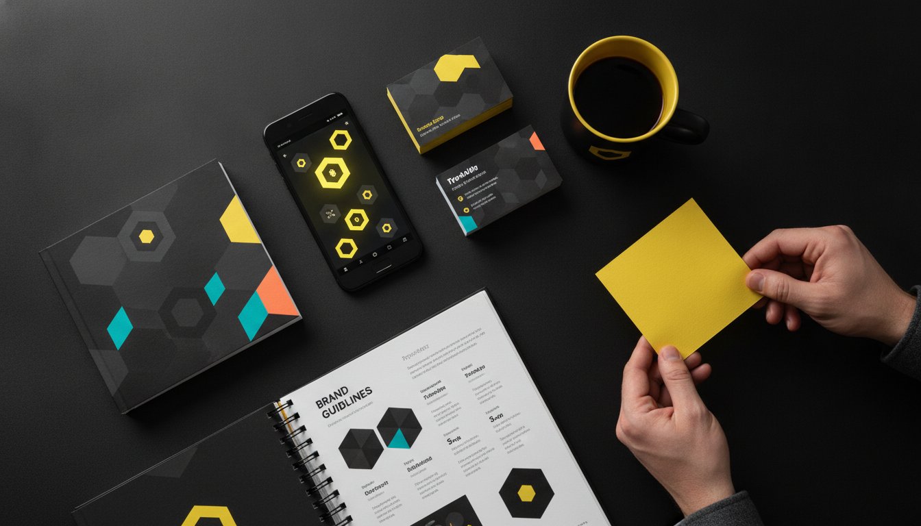
Precision is paramount here. Your manual must list HEX codes for digital, CMYK for standard print, and Pantone for specialised manufacturing. This ensures your signature blue looks the same in Sydney as it does in London. Consistent colour usage creates a visceral psychological impact that builds immediate brand recognition before a single word is read. Typography follows a similar logic. You need a clear hierarchy. Defining your primary heading fonts, secondary subheads, and body copy ensures your message is always delivered with the right "voice." If you're looking to refine these foundational elements, our team specialises in visual identity design that balances creativity with technical rigour.
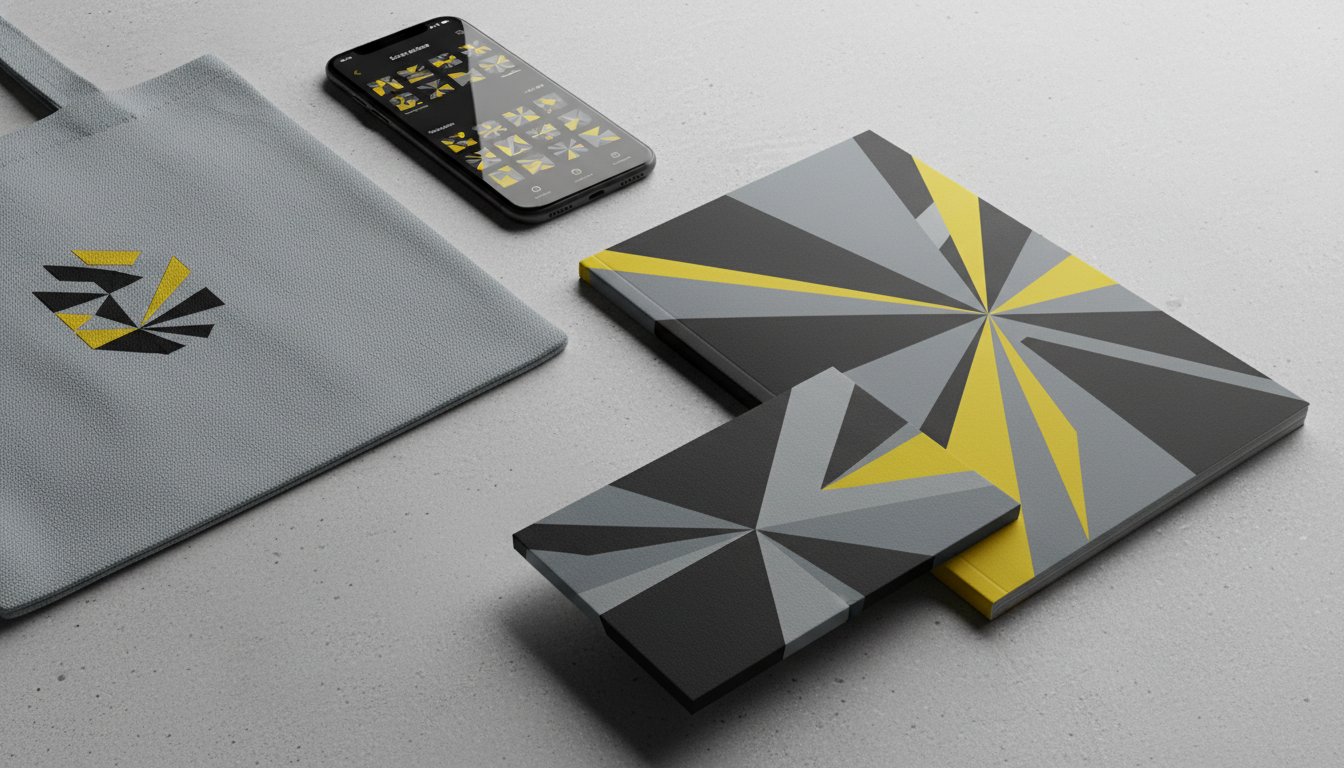
A brand is more than just shapes and colours. It's a feeling. Your manual should specify photography styles; do you use candid, high-contrast images or soft, staged studio shots? Even the colour grading of your photos should be documented. This extends to your tone of voice. Do you sound authoritative and bold, or supportive and warm? Finally, include iconography and graphic elements. These small details add depth and texture to your visual system, making it feel complete and professional.
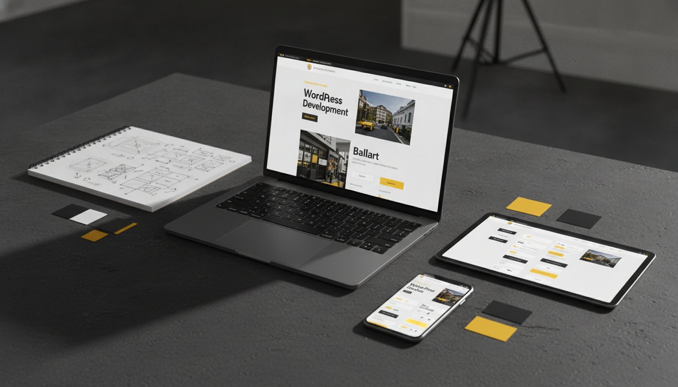
A brand identity manual focused solely on aesthetics is a missed opportunity. Design is never just about decoration; it's about communication. While a visually stunning document looks impressive on a screen, it's useless if it lacks a strategic foundation. Your manual must explain the "why" behind every choice. When you ground your visual rules in strategy, you create a tool that protects your brand equity. For example, if your business has deep Ballarat local roots, your visual choices should reflect that heritage. Earthy tones or specific typographic textures aren't just "nice" to have. They're strategic moves to build trust with your community.
Integrating a clear strategic purpose reduces design friction. It eliminates subjective debates during the creative process. Instead of asking if a layout "looks good," your team asks if it aligns with the established strategy. This shift stops decision fatigue and preserves your creative energy for high-level growth. The SBA Brand Guide offers a clear example of how strategic standards ensure every touchpoint feels deliberate and unified, regardless of the scale of the organisation.
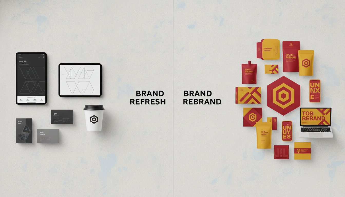
Abstract values must manifest physically to be effective. If your brand stands for "Innovation," this might translate into minimalist layouts, generous white space, and bold, asymmetrical grids. If "Trust" is your core pillar, you might lean toward stable serif fonts and a grounded, traditional colour palette. We've seen Melbourne firms use a brand identity manual to reposition themselves for significant growth. By aligning their visual cues with a new strategic direction, they create a bridge between their current state and a more ambitious future. This link ensures long-term visual recognition that resonates with the right audience.
Consistency pays tangible dividends. Research shows that consistent brand presentation across all platforms can increase revenue by up to 33%. This isn't just about sales; it's about efficiency. A strategic manual delivers ROI by:
It eliminates costly design errors and "guesswork" from external contractors.
Professional, high-end presentation allows you to command premium prices in the Australian market.
Clear rules mean faster marketing executions and quicker responses to market opportunities.
Investing in a comprehensive manual isn't an expense. It's a strategic move to ensure your brand remains a powerhouse as you scale.
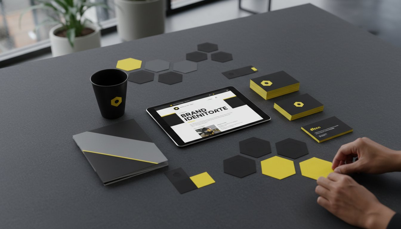
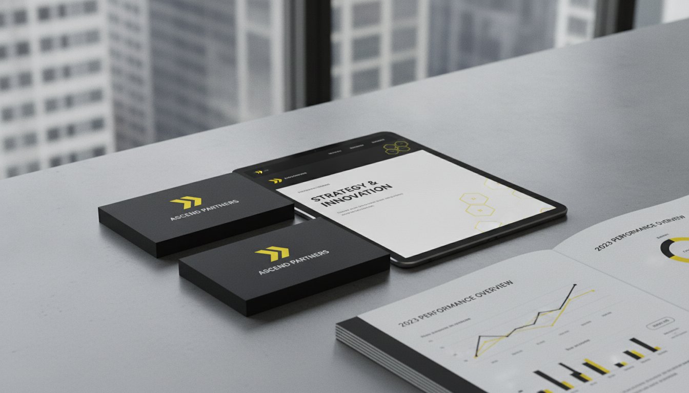
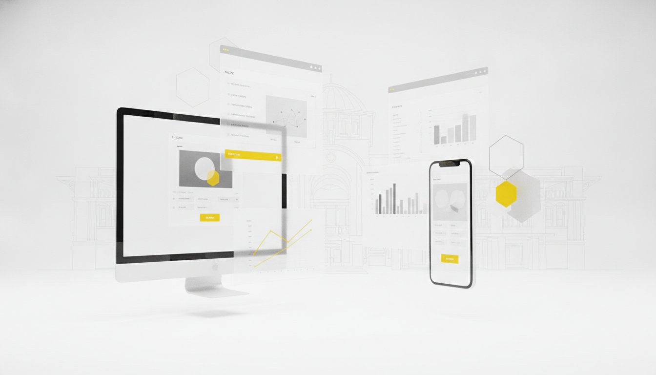
The era of the static 50-page PDF is ending. While these documents once served as the gold standard, they often become digital paperweights that are difficult to update and even harder to search. A modern brand identity manual must be as agile as the business it represents. Transitioning to digital brand portals or interactive cloud documents ensures your team always has the most current version at their fingertips. This accessibility is the first step in moving from theory to daily practice. It transforms a "rulebook" into a functional resource that people actually enjoy using.
Implementation fails when guidelines feel like a restriction rather than a resource. You need to train your team to see these rules as a framework for empowerment. When staff understand the logic behind the layout, they become invested in the outcome. For non-designers, the role of templates is vital. Providing pre-approved layouts for presentations, reports, or social tiles removes the temptation to "go rogue" with off-brand fonts or mismatched imagery. It allows your staff to produce high-quality content quickly while you maintain total control over the brand's visual integrity.
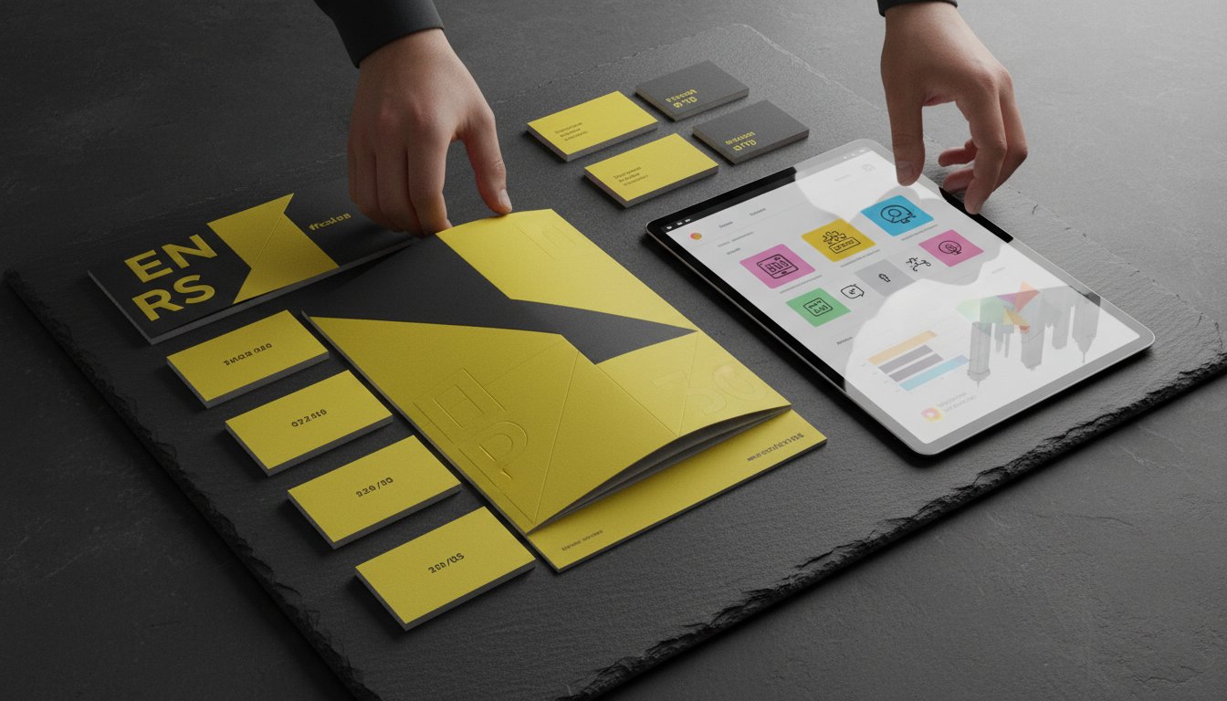
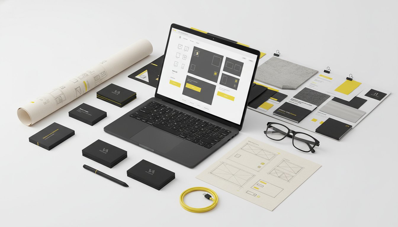
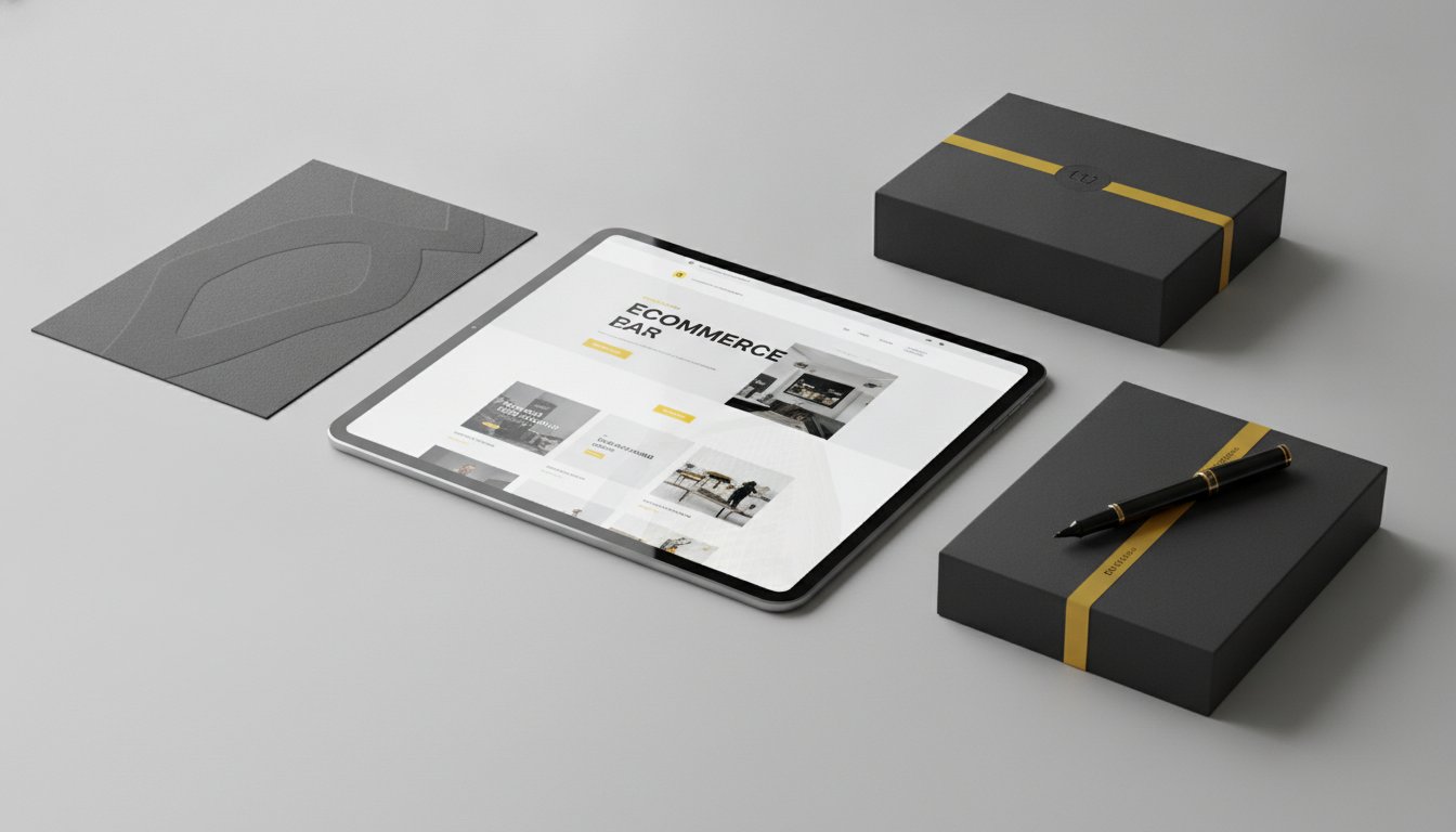
Organisation is the engine room of consistency. Your team needs immediate access to the right files; SVG for web, EPS for high-end print, and high-resolution PNG for internal documents. Using cloud-based tools like Canva or Adobe Express allows you to lock in brand colours and fonts within templates that anyone can use. Establishing centralised asset hubs is essential for remote teams to ensure every collaborator is pulling from the same source of truth. This level of organisation eliminates the "where is the logo?" emails that drain your team's productivity. If you need a partner to help build these systems, our expertise in visual identity design ensures your assets are both beautiful and functional.
Your business isn't static. Your guidelines shouldn't be either. A brand identity manual should evolve alongside your market position and technological shifts. We recommend an annual audit of all brand touchpoints. Check your environmental graphics, website, and packaging against the current manual. Are they still aligned? Does the tone of voice still resonate? This proactive approach ensures your manual stays relevant in a digital-first marketing landscape. It prevents brand drift before it starts, keeping your market presence sharp and intentional as your organisation grows.
Building a brand is a journey of intentionality. It requires a partner who sees beyond the immediate aesthetic to the long-term strategic goal. At Seamer Design, we don't just create logos; we build enduring systems. Our 20 plus years of experience in the Australian market ensures your brand is ready for the future. We bridge the gap between visionary strategy and high-impact design. This expertise allows us to transform a fragmented identity into a unified, professional powerhouse that commands respect in your industry.
Expertise matters when your market position is on the line. We understand the nuances of business growth and the importance of a disciplined visual presence. By partnering with us, you gain more than a service provider. You gain a strategic catalyst dedicated to your success. We help you move past the frustration of inconsistent messaging and toward a future where every touchpoint reinforces your brand's value and authority.
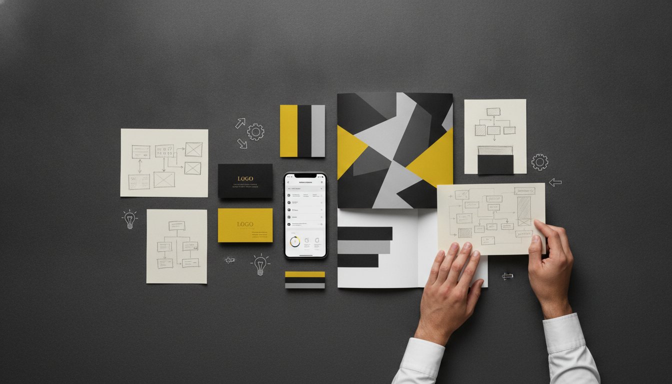
Our approach is methodical yet energetic. We begin with Discovery and Strategy. This phase is about uncovering the soul of your brand and defining your unique position in the market. We listen, we research, and we align our thinking with your commercial goals. Next, we move into Design and Refinement. Here, our team crafts a bespoke visual system that resonates with your audience. We focus on every detail, from typography to colour palettes, ensuring they reflect your core values.
The final stage is Documentation. This is where we deliver a comprehensive brand identity manual that empowers your team. This document isn't a static set of rules. It is a functional, working tool that provides the clarity needed to maintain consistency across print, digital, and environmental graphics. It ensures that every creative partner you work with in the future understands exactly how to represent your brand with precision.
We provide local expertise with a sophisticated, national perspective. Whether you are a growing business in Ballarat or a corporate entity in Melbourne, our solutions are tailor-made for your specific challenges. We specialise in visual identity design and brand strategy that drives real results. Our goal is to make your brand feel visionary yet grounded, providing you with the tools to scale with confidence.
Consistency is the hallmark of a professional organisation. It is time to stop guessing and start leading with a cohesive visual mission. Ready to unify your brand? Let’s organise a discovery session.
A brand is only as strong as its most recent touchpoint. We have explored how a robust brand identity manual acts as your strategic anchor; it ensures every visual and verbal interaction builds trust and recognition. By bridging the gap between high-level strategy and practical design, you eliminate the friction that slows down your team. You move from a fragmented market presence to a cohesive, professional powerhouse that is ready to scale.
Success in a competitive market requires more than just a logo. It demands a disciplined system that empowers your staff and creative partners to execute with precision. With over 20 years of design excellence, Seamer Design specialises in crafting bespoke systems for the Melbourne and Ballarat business communities. Our collaborative, strategy-led creative process ensures your identity is built on a foundation of genuine purpose. Elevate your brand with a bespoke identity manual from Seamer Design.
It is time to stop reacting to immediate design needs and start leading with a unified vision. We are ready to help you craft an enduring brand that resonates with clarity and moves your business forward with confidence.
A style guide typically focuses on the "what," while a brand identity manual explains the "why." A style guide might simply list your colours and fonts. In contrast, a manual provides the strategic context and functional rules needed to apply those elements across diverse platforms. It serves as a comprehensive roadmap for your entire brand expression, ensuring your visual and verbal identity remains unified as your business grows.
Every business benefits from a clear set of rules, regardless of its size. Startups often face "brand debt" when they rush into marketing without a plan. Having a manual from the beginning ensures your first hire and your fiftieth hire are both working from the same playbook. It protects your professional image during those critical early stages of growth and prevents costly rebrands later in your journey.
Most comprehensive manuals take between four and twelve weeks to complete. This timeframe allows for deep strategy sessions, visual exploration, and technical documentation. The process is a collaborative journey where we refine your visual system to ensure it meets your specific commercial goals. Rushing this phase can lead to gaps in your guidelines, so we prioritise thoroughness to ensure your brand remains enduring and effective.
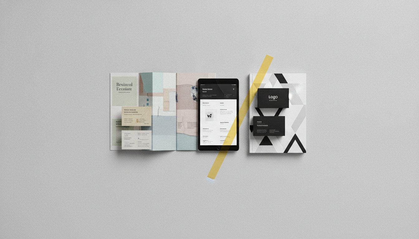
Your asset library must include a mix of vector and raster files to cover all applications. SVGs are essential for modern web design, while EPS or high-resolution PDFs are required for professional printing. You should also provide PNG files with transparent backgrounds for internal documents and presentations. Organising these files into a centralised hub ensures your team always uses the correct version for every specific task.
We recommend a brand audit every twelve months to ensure your guidelines remain effective. While your core logo and primary colours shouldn't change frequently, your digital applications or imagery styles might need refinement. A biennial update is common for businesses operating in fast-moving industries. This proactive approach keeps your brand feeling fresh and relevant without losing the recognition you have worked hard to build over time.
A logo is just the starting point for a complete brand system. We take your existing mark and build the necessary framework around it, including typographic hierarchies and secondary graphic elements. This process transforms a single asset into a functional brand identity manual. It ensures that your logo is supported by a cohesive visual language that works across your website, packaging, and environmental signage.
Responsibility usually falls to a designated "Brand Guardian," such as a marketing manager or a business owner. This person acts as the internal point of contact for all brand-related questions. They ensure that every piece of content, from a social post to a major billboard, aligns with your standards. Having a single person oversee this process maintains the integrity of your visual presence and reduces internal confusion during the creative process.
The most effective way is to provide them with your brand identity manual during the initial onboarding phase. Clear guidelines eliminate subjective interpretation and reduce the need for endless feedback loops. When contractors have the rules for clear space, colour codes, and typography at their fingertips, they can deliver high-quality work faster. It sets a professional standard from day one and protects your brand equity across all touchpoints.


.jpg)
.jpg)
%20(1).jpg)