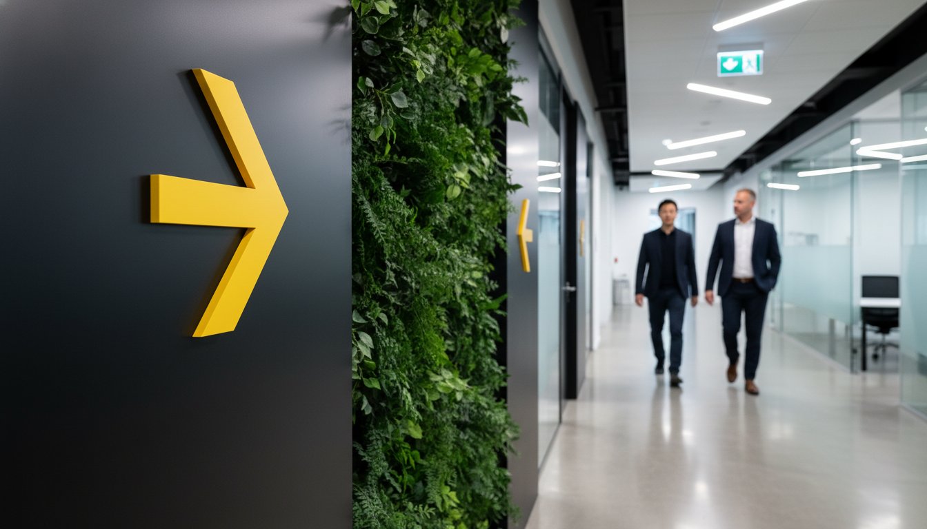
Wayfinding isn't about signs; it's the silent conversation between your brand and the person moving through your physical world. When wayfinding signage design is treated as a secondary thought, visitors quickly become frustrated and your brand identity feels disjointed. You've likely experienced the friction of a poorly marked corridor or a sign that feels cheap and clutters a beautiful interior. It creates an immediate sense of unease that lingers long after a guest leaves. We believe every touchpoint should empower your visitors rather than confuse them.
Discover how to transform complex environments into intuitive, branded experiences that guide people with absolute ease. This guide explores how to achieve a seamless visitor journey while ensuring full compliance with Australian Standards like AS 1428.1:2021. You'll learn to balance bold typography with tactile elements and strategic colour use to improve navigation. We'll examine the intersection of brand strategy and accessibility to ensure your space feels professional, inclusive, and distinctly yours. It's time to bridge the gap between a cluttered environment and a visionary, guided experience.
• Reframe signage as a strategic information system. Learn to reduce navigation anxiety and empower visitor movement.
• Master the psychology of mental maps. Use landmarks to help guests solve spatial problems intuitively in complex spaces.
• Bridge the gap between digital and physical branding. Apply intentional wayfinding signage design and materiality to elevate your professional identity.
• Navigate Australian accessibility requirements with confidence. Understand the role of Australian Standards in creating legally compliant, inclusive environments.
• Optimise the user journey through strategic mapping. Discover how identifying key decision points creates a seamless, stress-free visitor experience.
Imagine walking into a building for the first time. You're looking for a specific office, but the walls are blank. The corridors feel like a maze. That feeling of hesitation is navigation anxiety. Effective wayfinding signage design eliminates this friction. It isn't just about sticking a few signs on a wall. It's a strategic system of information that makes a space legible. When a space is legible, people understand its layout instinctively. To understand the deeper roots of this discipline, it's helpful to look at What is Wayfinding and how it has evolved from ancient navigation to modern architectural psychology.
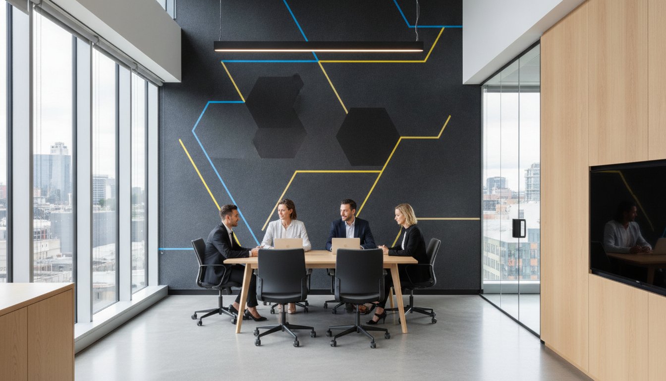
Wayfinding is a vital subset of Environmental Graphics. It bridges the gap between your visual identity and the physical environment. For new employees and high-value clients, the ease with which they navigate your office defines their first impression. A professional, well-guided journey signals that your business is organised, thoughtful, and authoritative. It removes the stress of the unknown, allowing visitors to focus on the purpose of their visit rather than the logistics of the corridors.
Successful navigation relies on four distinct types of information. Each serves a specific purpose in the user journey:
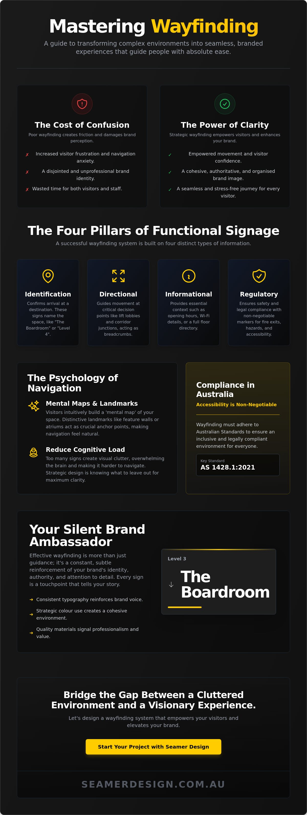
These signs name the destination. Think "The Boardroom" or "Level 4." They confirm a visitor has arrived at the right spot.
These are the breadcrumbs of your space. They guide movement at critical decision points like lift lobbies or corridor junctions.
These provide essential context. They might list opening hours, Wi-Fi details, or a comprehensive floor directory.
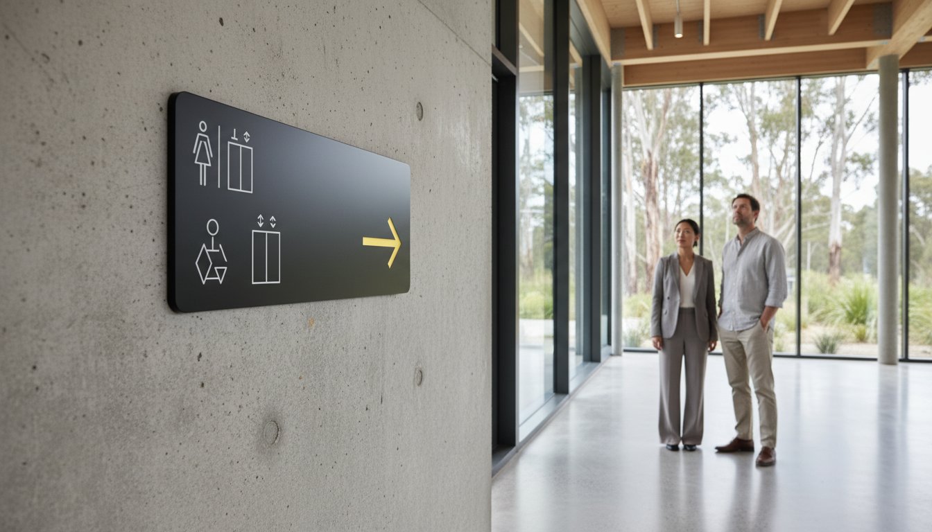
These are non-negotiable safety markers. Fire exits, "No Entry" zones, and accessible toilet signs ensure your space meets legal requirements and remains safe for everyone.
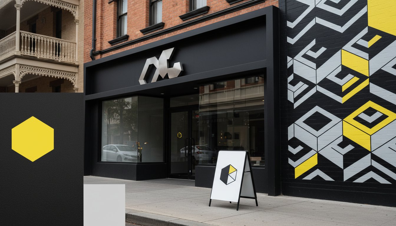
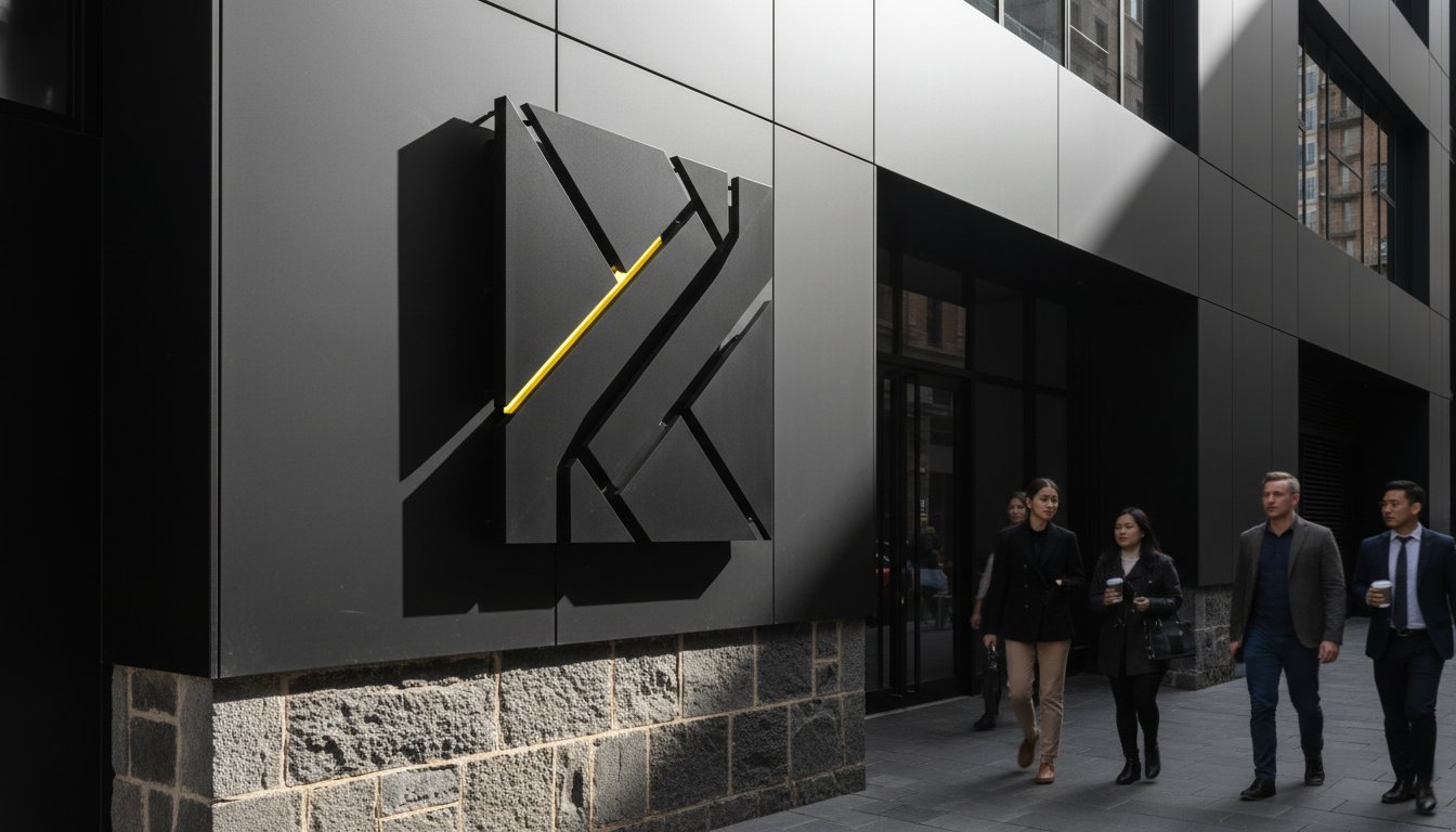
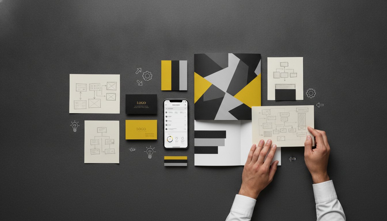
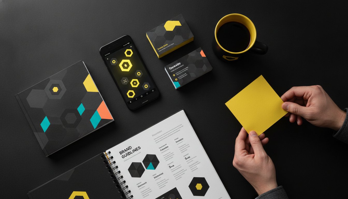
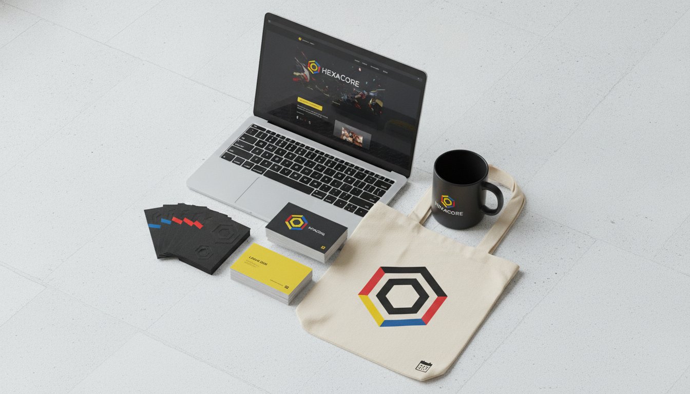
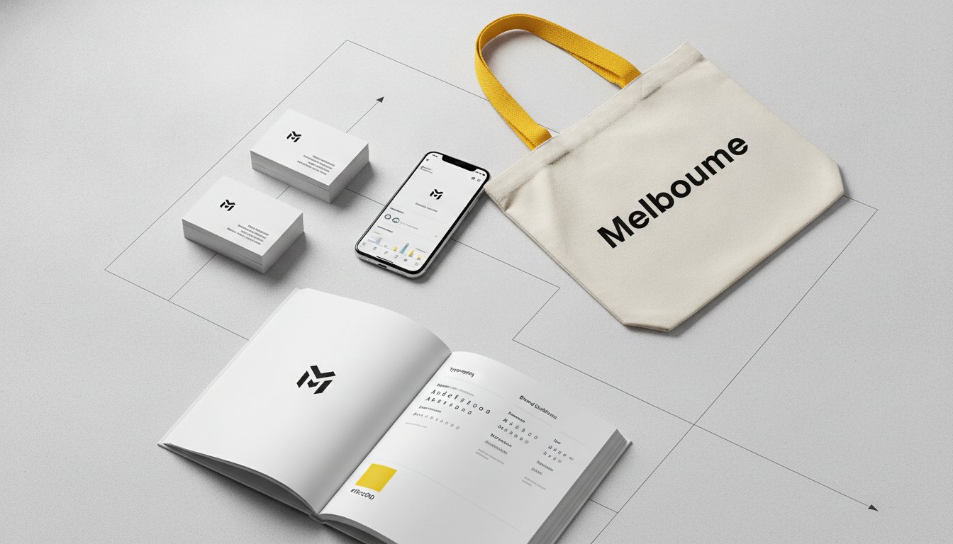
Your signage is a silent ambassador for your brand. It speaks when you aren't there. Using consistent typography and specific colour palettes reinforces your brand authority. There's a profound difference between a merely functional sign and a branded experience. One just tells you where to go. The other makes you feel connected to the space.
Strategic wayfinding signage design creates a sense of place. We've seen this transformation in action. A Ballarat business used custom signage to modernise a heritage-listed space. By blending modern environmental graphics with original architectural features, they created an environment that felt both historic and forward-thinking. This approach doesn't just show the way. It tells your story and builds trust with every step a visitor takes.
Finding your way through a new environment is a complex mental exercise known as spatial problem solving. It isn't a passive act. Your visitors are actively scanning for cues to build a mental map of your office or campus. Wayfinding signage design works best when it aligns with these natural cognitive processes. By providing clear markers at the right moments, you help people move with confidence rather than confusion.
Landmarks play a vital role in this process. A distinctive feature, such as a feature wall or a central atrium, acts as an anchor point in the mind. These visual highlights allow people to orient themselves quickly. In high-traffic Melbourne hubs, where spaces can feel overwhelming, simplicity becomes the ultimate sophistication. Research into the core principles of wayfinding suggests that we rely on these structured paths to navigate without exhausting our mental energy.
We must also address cognitive load. This is the mental effort required to process information. When you clutter a space with too many signs, you actually make it harder to navigate. People stop seeing the information and start feeling lost. Strategic design is about knowing what to leave out. Creating a space that flows naturally starts with a cohesive Brand Strategy that aligns your physical environment with your business goals.
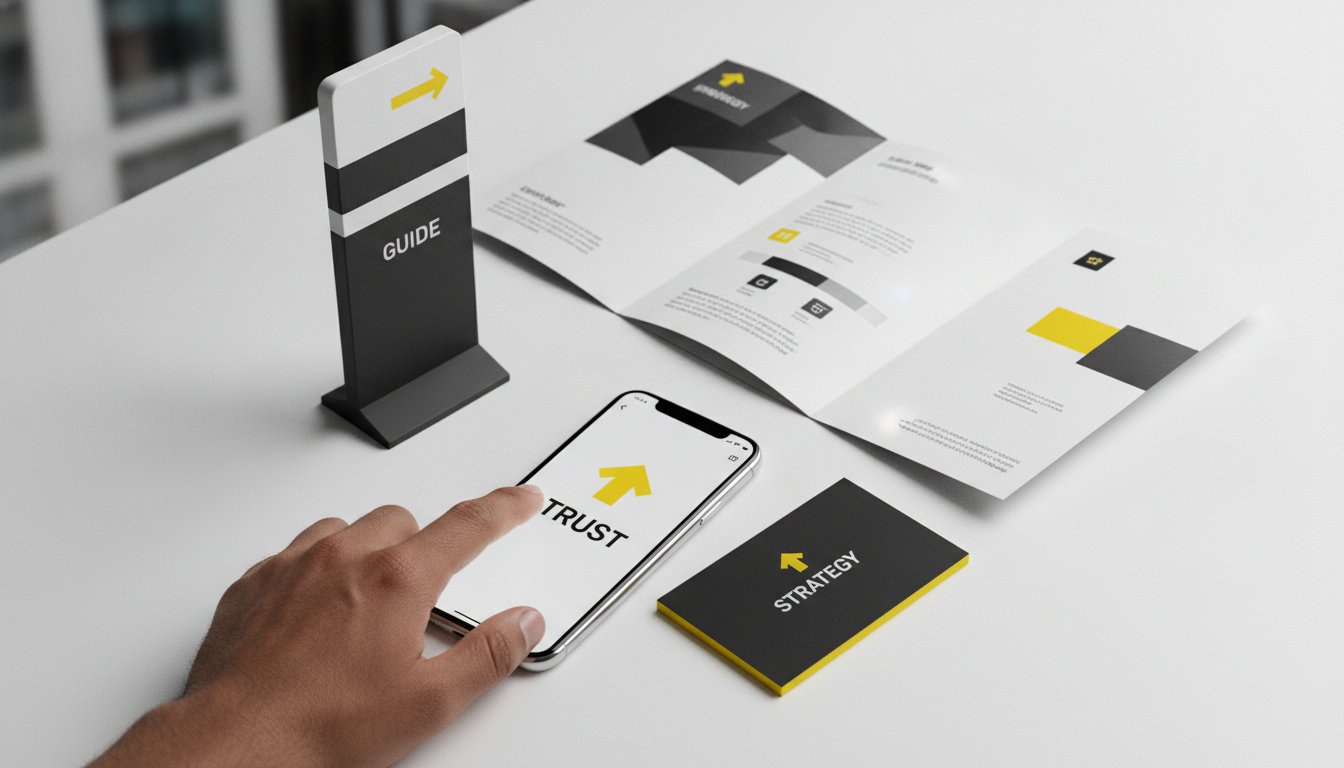
Your signs must stand out from the architectural background. High contrast and clear typography are essential for visibility.
Use the same logic and symbols throughout the entire journey. If the "Exit" sign changes colour or font halfway through, you break the user's trust.
Strip away non-essential details. A sign should communicate its message in a split second.
Place signs in areas free from visual noise. A sign competing with a busy digital screen will often be ignored.
Provide "confirmation signs" along long corridors. These tell the visitor they are still on the right path to their destination.
We approach every project by identifying critical decision points. These are the moments where a visitor must choose a direction, such as at a lift lobby or a T-junction. We design specifically for the first-time visitor who has zero prior knowledge of your layout. By considering sightlines and viewing distances common in Australian office layouts, we ensure every sign is legible from the moment it's needed. This methodical approach transforms a confusing floor plan into an empowering, intuitive experience.
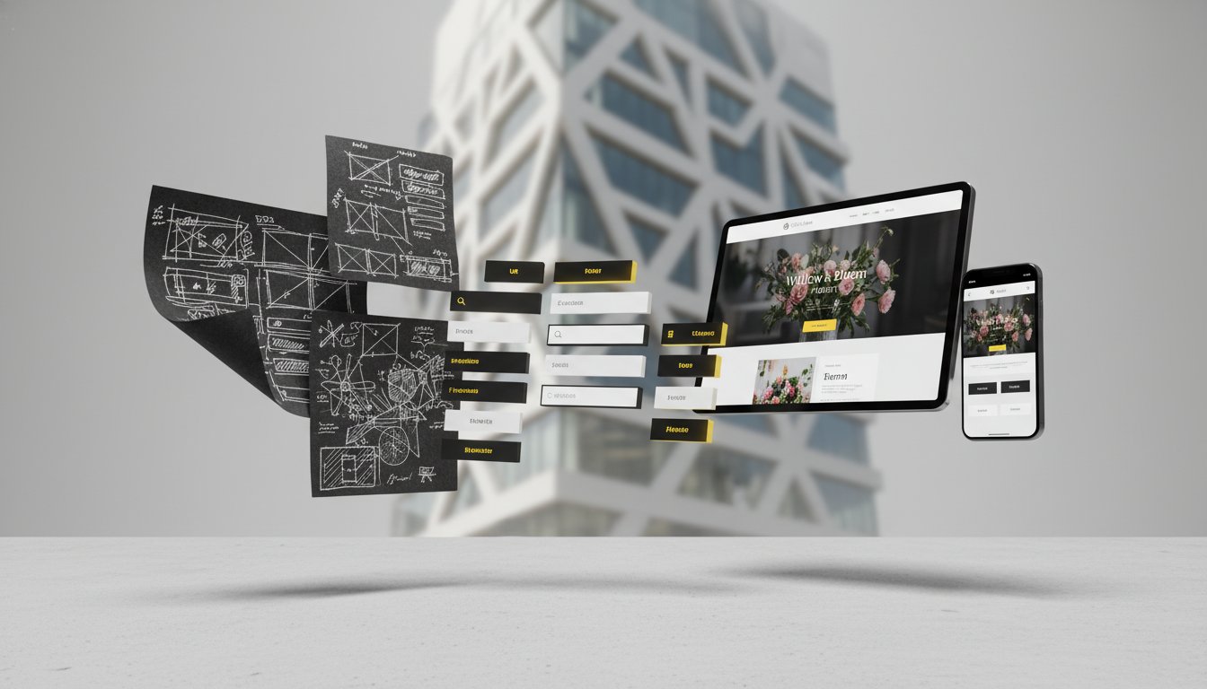
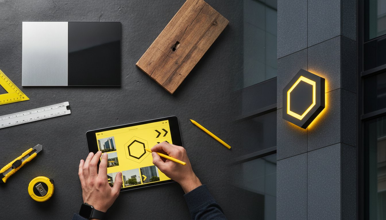
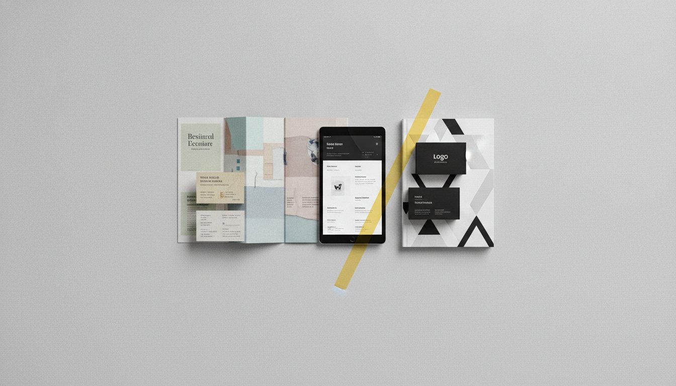
Your brand exists beyond a screen. It lives in the textures of your lobby and the curves of your signage. Strategic wayfinding signage design bridges the gap between your digital presence and the physical reality of your office. It ensures that the promise made on your website is kept the moment a client steps through your front door. This transition must be seamless. It requires a deep understanding of how visual cues translate from a flat surface into a three-dimensional environment.
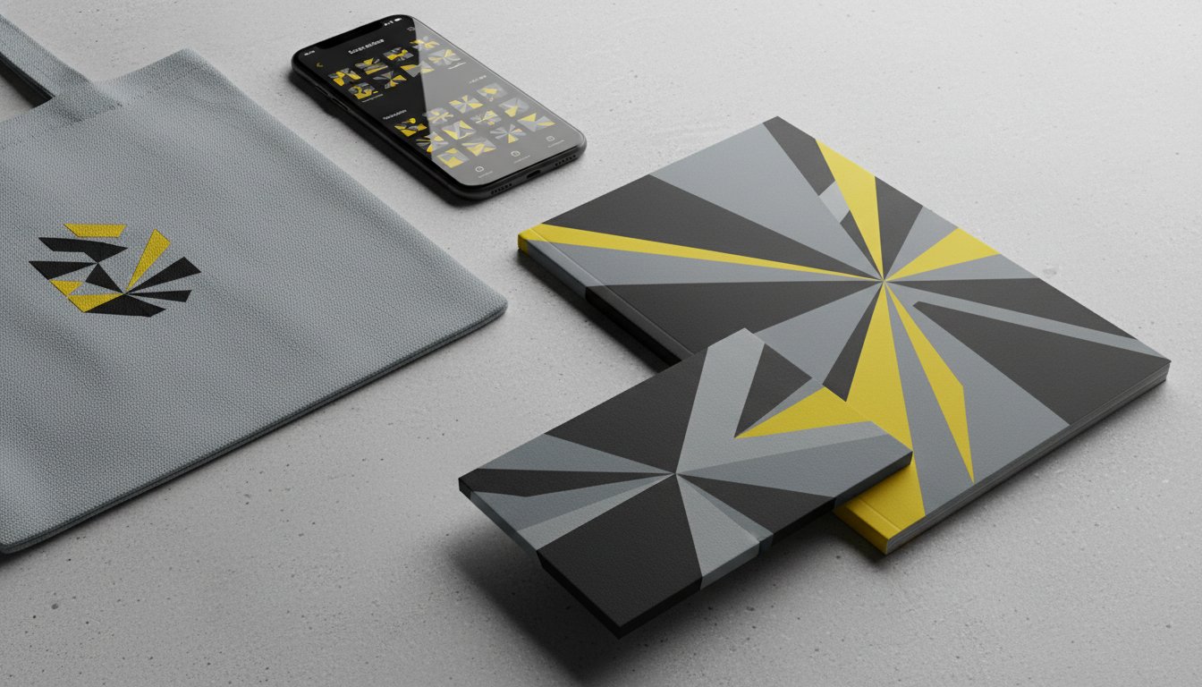
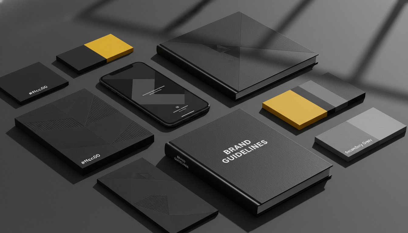
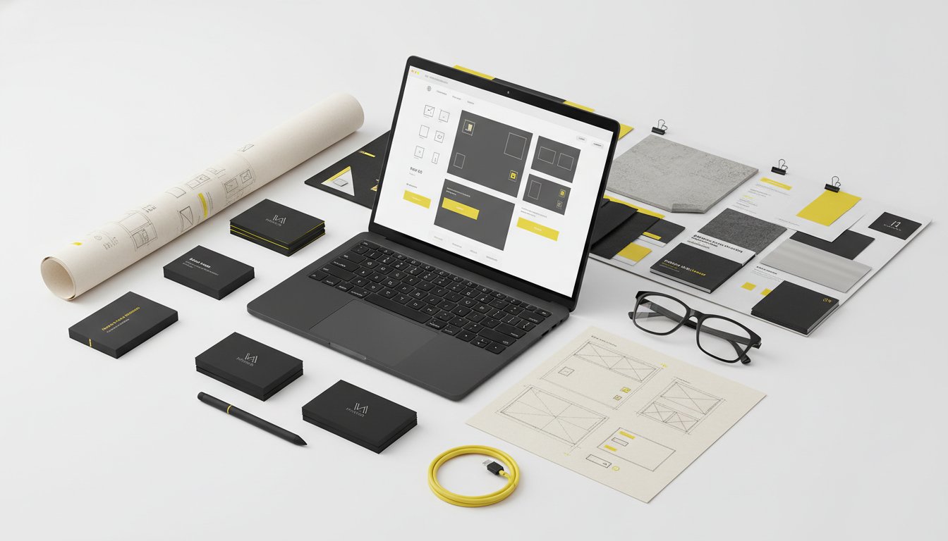
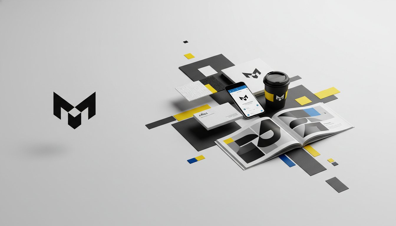
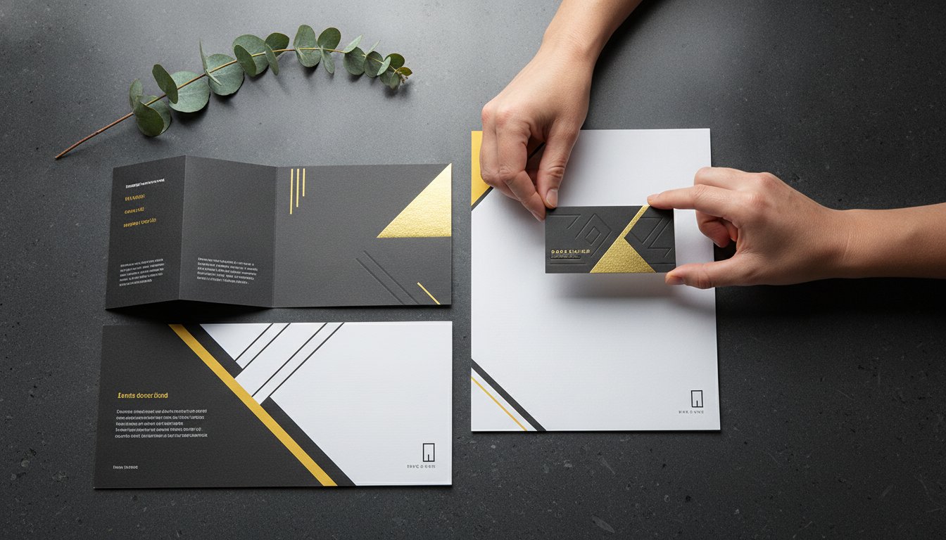
Relying on "off-the-shelf" signage can actively damage a high-end corporate brand. Generic plastic signs often clash with bespoke interiors. They signal a lack of intentionality. Instead, your signage should be a physical extension of your visual identity manual. Every typeface, colour, and icon must feel like part of a unified story. This level of customisation transforms a basic utility into a branded experience that reinforces your authority with every step a visitor takes.
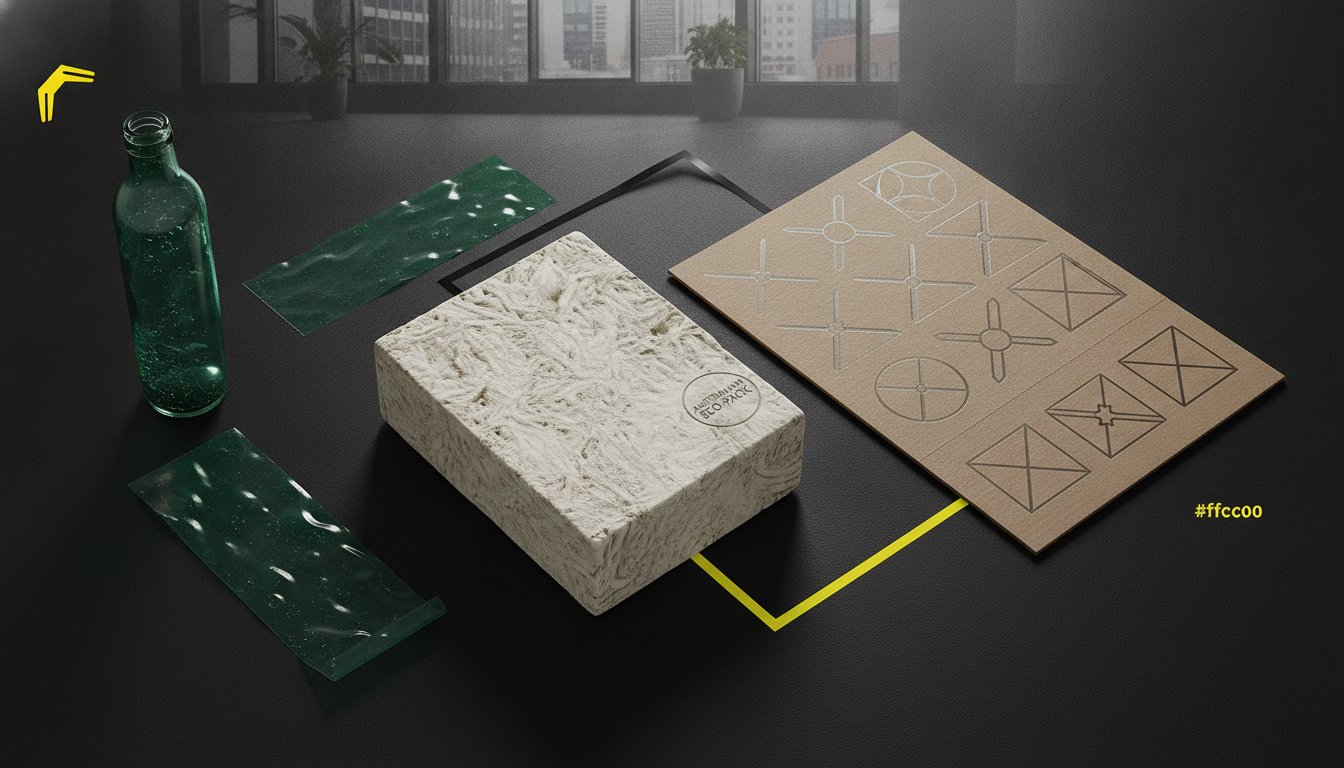
Choosing the right materials is a strategic decision. You might select warm timbers to reflect a supportive culture or brushed metals for a tech-driven firm. These finishes must complement Melbourne's diverse architectural styles, from industrial North Melbourne warehouses to sleek CBD towers. Tactile elements like raised lettering and specific textures don't just add a premium feel; they're often essential for accessibility. Adhering to the Australian Standard for wayfinding ensures your space is inclusive for those with vision impairments. Sustainability is also a key driver. Modern Australian offices now favour durable, eco-friendly materials that reduce environmental impact without sacrificing aesthetic quality.
Wayfinding should move beyond simple directional arrows. We look for opportunities to create "Brand Moments." These are large-scale graphics that tell your company's story. In Ballarat studios, we've used office interior graphics to turn plain walls into narrative journeys. This approach integrates your history and values into the very fabric of the building. We also consider the integration of digital wayfinding screens. These shouldn't feel like an afterthought. When designed correctly, they sit flush within the physical aesthetic, offering real-time information while reinforcing your forward-thinking identity. This blend of the tactile and the digital creates a truly modern, intuitive environment.
Compliance is not a creative limitation. It is a commitment to your community. In Australia, wayfinding signage design must adhere to strict legal frameworks to ensure every visitor can navigate a space independently. The primary benchmark is AS 1428.4.2, which governs wayfinding for people with vision impairments. This standard, alongside the updated AS 1428.1:2021, ensures that your office provides a "continuous accessible path of travel." Following these regulations is a legal necessity under the Disability Discrimination Act (DDA) and the National Construction Code (NCC) 2022 Amendment 2, which came into full effect on 29 July 2025.
Inclusive design is both an ethical choice and a strategic one. Braille and tactile elements are non-negotiable in public and commercial spaces. They empower users with low vision to identify destinations and hazards without assistance. We focus on integrating these elements so they feel like a natural part of the architecture. High-quality Braille doesn't have to look clinical. When executed with precision, it adds a layer of sophisticated detail that reflects a brand's dedication to accessibility and professional excellence.
Every Melbourne building owner must manage a complex list of statutory requirements. Fire safety signs, emergency exit paths, and floor levels must meet specific size and placement criteria. A critical factor here is Luminance Contrast. The 2021 standards provide detailed procedures for assessing how well a sign stands out from its background. We also design for neurodiversity. Using clear, universal icons and simple language helps people process information quickly, reducing the mental strain of navigation in high-pressure environments.
Navigating the local landscape requires a nuanced approach. In historic Ballarat precincts, heritage overlay restrictions often dictate what can be fixed to a facade or interior wall. We solve this by designing non-invasive mounting systems that respect the building's history while meeting modern standards. Conversely, high-density Melbourne CBD towers require wayfinding signage design that can compete with vast glass surfaces and complex lighting. The goal is to integrate statutory signs seamlessly into a bespoke interior. We ensure your safety markers and directional cues elevate your space rather than clashing with your high-end aesthetic.
Ready to align your space with the latest Australian Standards? Explore our expert Environmental Graphics & Signage services to create a compliant, beautiful environment.
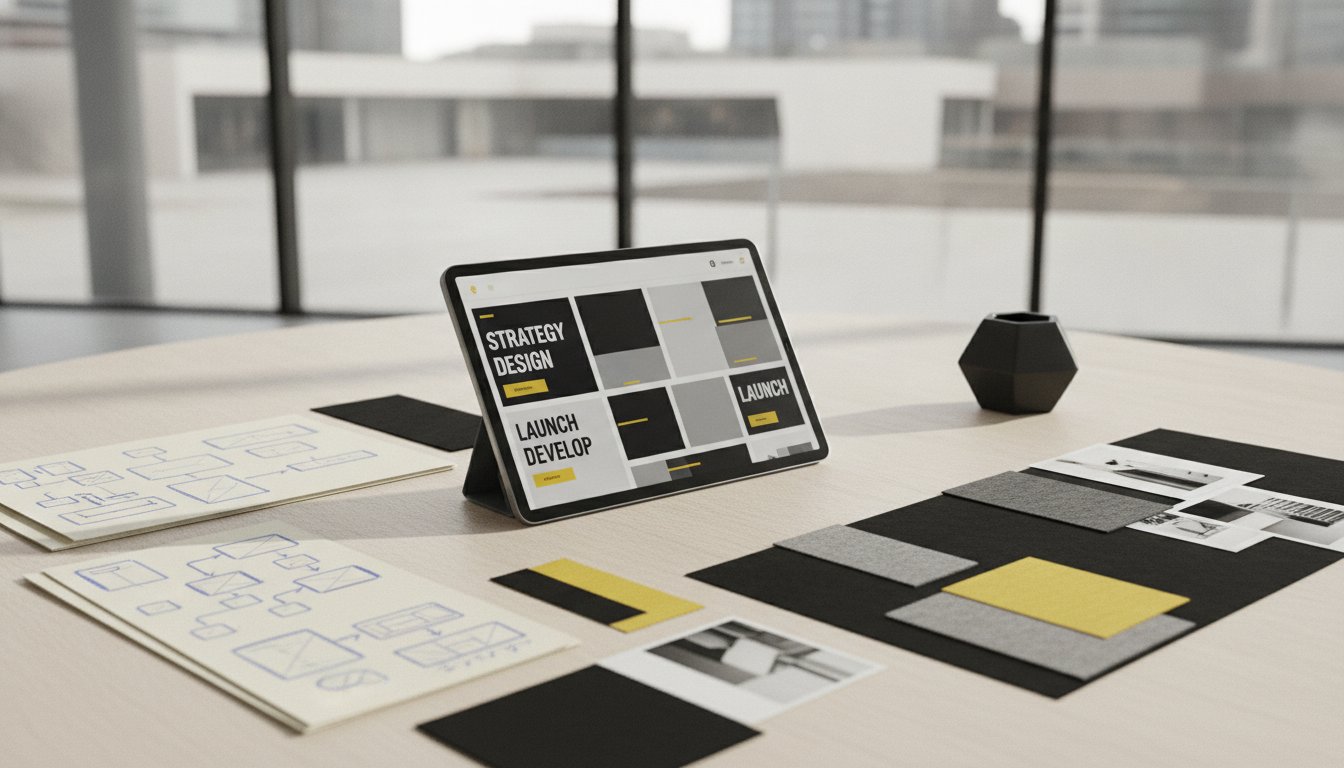
We don't just design signs; we orchestrate movement. Our process is a methodical yet energetic journey. It transforms your physical environment into a strategic asset. It begins with Discovery. We dive deep into your brand goals and the specific flow of your space. We want to know how your team works and how your clients feel when they arrive. This isn't a surface-level chat. It's an intentional exploration of your vision and the unique challenges of your floor plan.
Strategy follows. We map the entire user journey to identify every critical decision point. This ensures that wayfinding signage design provides the right information at exactly the right moment. Once the logic is sound, we move into Design. Here, our creatives craft custom concepts that elevate your visual identity. We bridge the gap between your digital presence and your physical office walls. Every icon, typeface, and material is chosen to reinforce your brand's authority and warmth.
Implementation is where the vision becomes reality. We manage the entire lifecycle, from production to precision installation. Every element is checked for a flawless finish. We don't believe in "near enough." We believe in perfection that reflects your professional standards. Our team ensures that the final result is durable, compliant, and perfectly aligned with your architectural aesthetic.
Our strategists and designers work as a single unit. We solve spatial problems through a rigorous site audit. We literally walk the path your customers take. We look for blind spots, confusing junctions, and lighting challenges. We then move to prototyping and testing. Seeing how a design works in the shifting light of a Melbourne afternoon or a Ballarat winter morning is essential. It ensures legibility remains constant and the visitor experience stays seamless throughout the day.
Choosing a boutique agency means you get a tailored, high-impact solution. We aren't a cold consultancy; we are your creative catalyst and strategic partner. Our commitment to Ballarat and Melbourne businesses is personal. We understand the local market and the need for a competitive edge. We don't just execute tasks. We champion your goals and empower your visitors to navigate with absolute confidence.
Ready to transform your environment? Connect with our design team to start your journey toward a more intuitive, branded space.
Strategic wayfinding signage design is the final layer that turns a complex building into an intuitive, branded destination. By aligning spatial psychology with the latest Australian compliance standards, you remove the friction of navigation and replace it with a sense of absolute ease. A space that is effortless to navigate is a space that builds immediate trust. It reflects your commitment to professional excellence and makes every visitor feel empowered from the moment they arrive.
With over 20 years of strategic design expertise, we specialise in creating sophisticated branded environments across Melbourne and Ballarat. Our collaborative approach ensures your project moves seamlessly from initial strategy to precision installation. We bridge the gap between your visionary goals and the physical reality of your office. Start your wayfinding transformation with Seamer Design. Let's work together to create a space that guides, inspires, and leaves a lasting impression on everyone who walks through your door.
Signage refers to the individual physical markers within a space. Wayfinding is the comprehensive strategy used to guide people through an environment. Think of signage as the tool and wayfinding as the map. A successful system uses both to reduce navigation anxiety and create a seamless, intuitive journey for every visitor.
Yes, Braille and tactile elements are a legal requirement for specific signs in Australian commercial buildings. Under the National Construction Code (NCC) and AS 1428.1:2021, signs for sanitary facilities, hearing augmentation, and emergency exits must include these features. It ensures your office is inclusive and fully compliant with the Disability Discrimination Act.
Costs depend entirely on the scale and complexity of your environment. A small office refresh differs significantly from a multi-level campus rollout. We recommend a discovery session to define your specific requirements and brand goals. This allows us to provide a tailored strategy that aligns with your vision and the unique flow of your space.
AS 1428.4.2 is the primary Australian Standard for wayfinding. It specifically addresses the needs of people with vision impairment. This standard outlines requirements for tactile indicators and the placement of descriptive markers. Adhering to these standards ensures your wayfinding signage design provides a continuous accessible path of travel for all Australians.
Absolutely. High-quality wayfinding signals that your business is organised, thoughtful, and inclusive. When visitors navigate your space with ease, it builds immediate trust in your brand authority. It transforms a potentially stressful experience into a professional, branded journey that reflects your absolute attention to detail and care for the visitor experience.
The timeline varies based on the scope of the site audit and the complexity of the installation. A typical project moves through discovery, strategy, design, and production over several weeks. We work closely with your team to ensure the process remains efficient and aligns perfectly with your building's opening or renovation schedule.
Yes, we manage the entire process from initial strategy through to precision installation. Our team ensures every sign is placed with absolute accuracy for maximum visibility and compliance. This end-to-end approach guarantees a flawless finish that matches the original design intent and your architectural aesthetic, providing a complete solution for your business.
Durable materials like marine-grade aluminium, stainless steel, and UV-stable acrylics are best suited for the harsh Australian climate. These choices resist fading and corrosion, ensuring your wayfinding signage design remains legible and professional for years. We select finishes that complement your building's exterior while providing maximum longevity against intense sun and heavy rain.


.jpg)
.jpg)
%20(1).jpg)