What if the reason your brand feels "amateur" has nothing to do with your logo and everything to do with the space between its letters? It's a common frustration. You've built a sophisticated business, yet your visual identity feels slightly off-centre. Perhaps you're lost in the weeds of technical jargon like kerning and leading, or you're struggling to choose a font that works across both digital screens and physical signage. With 85% of websites now using sans-serif fonts, standing out requires more than just following the crowd. Strategic typography in branding is the missing link that bridges this gap.
We understand that great design is about more than just aesthetics; it's a strategic tool for growth. In this guide, you'll discover how the right typeface transforms your brand identity from a simple logo into a powerful, emotive visual voice. We'll explore the ROI of professional typography and show you how to communicate your brand values through deliberate type choices. You'll gain a practical framework for evaluating design proposals with confidence. It's time to move beyond the technical and focus on the transformative. Let's elevate your brand from the ground up.
• Learn how specific font shapes trigger emotional responses to align your brand’s visual personality with customer expectations.
• Master the "Rule of Two" to create a balanced system that guides the reader’s eye through your content with clarity.
• Discover why typography in branding acts as your silent ambassador, establishing authority and warmth before a single word is read.
• Prioritise legibility and accessibility to ensure your brand performs flawlessly on mobile screens and across digital platforms.
• Explore the strategic value of a bespoke typographic system designed to elevate your business within the Melbourne and Ballarat markets.
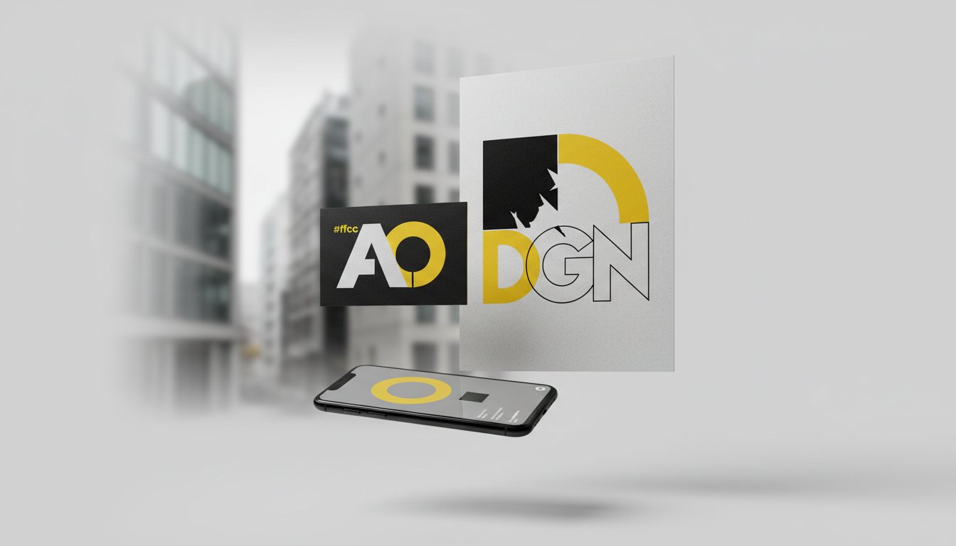
Typography is far more than a decorative choice. It is the strategic arrangement of type to create a distinct visual personality that resonates with your target audience. Think of it as the strategic layer of your brand identity. While your logo might be the face of your business, typography is the visual voice that speaks for you when you aren't in the room. It acts as the silent ambassador of your brand’s values, conveying professionalism, innovation, or heritage without needing a single image to support it. This concept of the fundamentals of typography involves a deep understanding of how letterforms interact with space to evoke specific feelings and drive consumer behaviour.
Many people use the terms font and typeface interchangeably, but distinguishing between them is vital for strategic design. A typeface is the specific design of the letters, the artistic work itself. A font is the digital file or tool used to display that design. When we talk about typography in branding, we are looking at how these designs create a visual voice. This voice speaks directly to your audience's subconscious. It sets expectations about your price point, your reliability, and your industry authority before they process a single word of your copy. A bold, modern sans-serif might suggest forward-thinking technology, while a classic serif implies a history of excellence and stability.
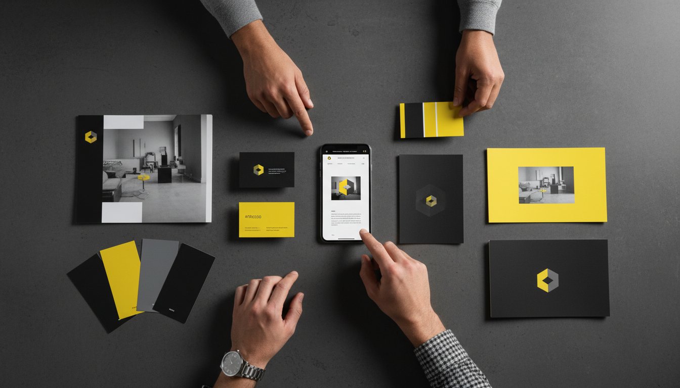
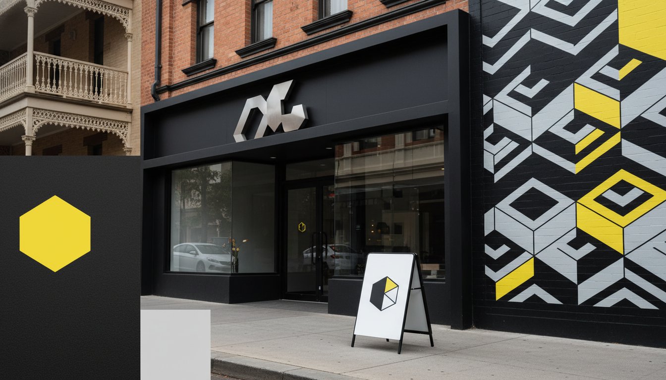
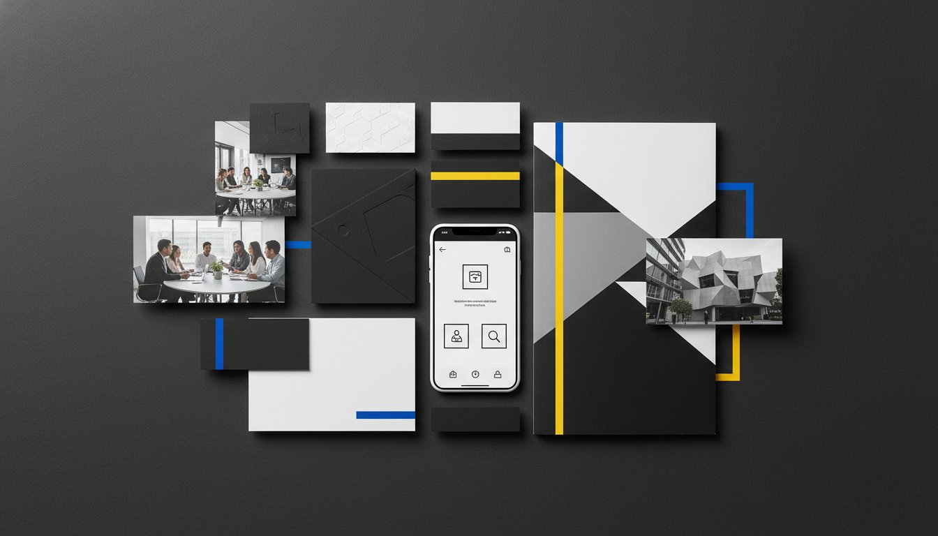
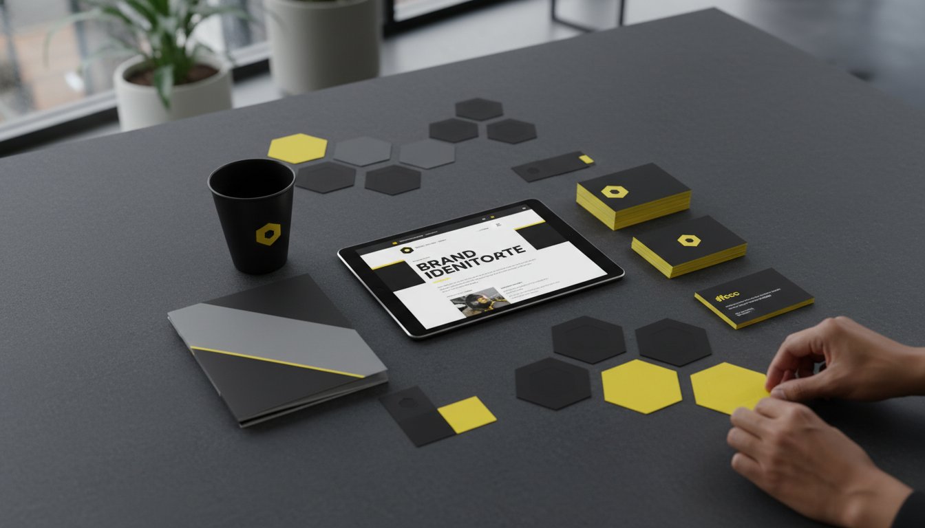
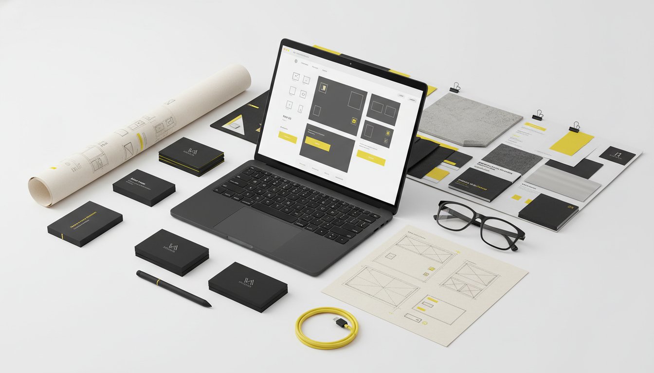
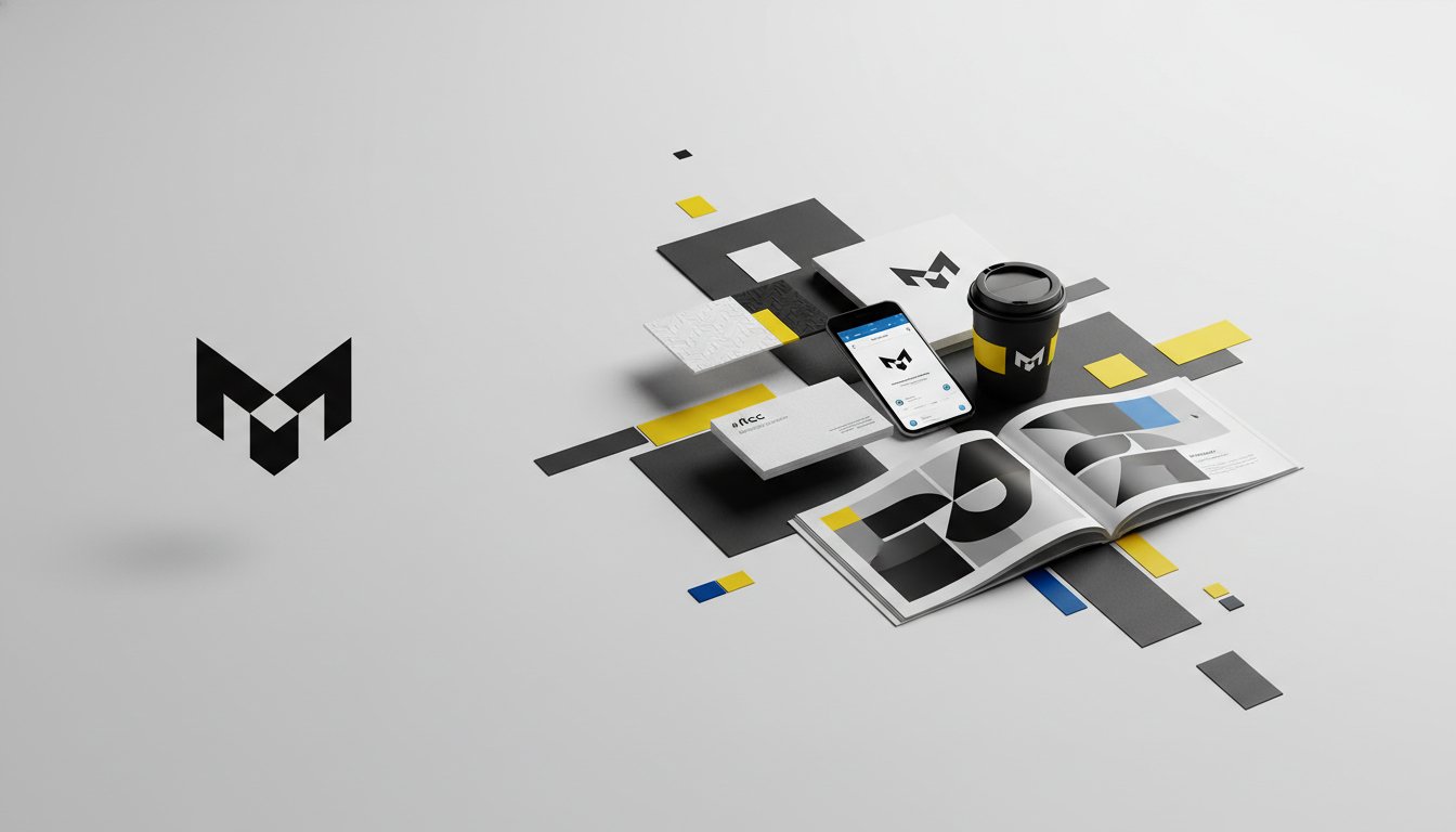
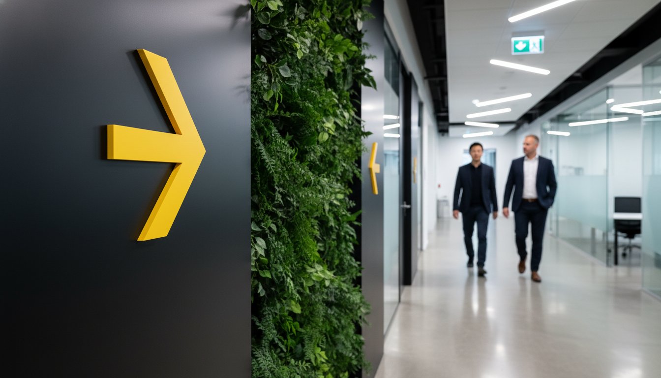
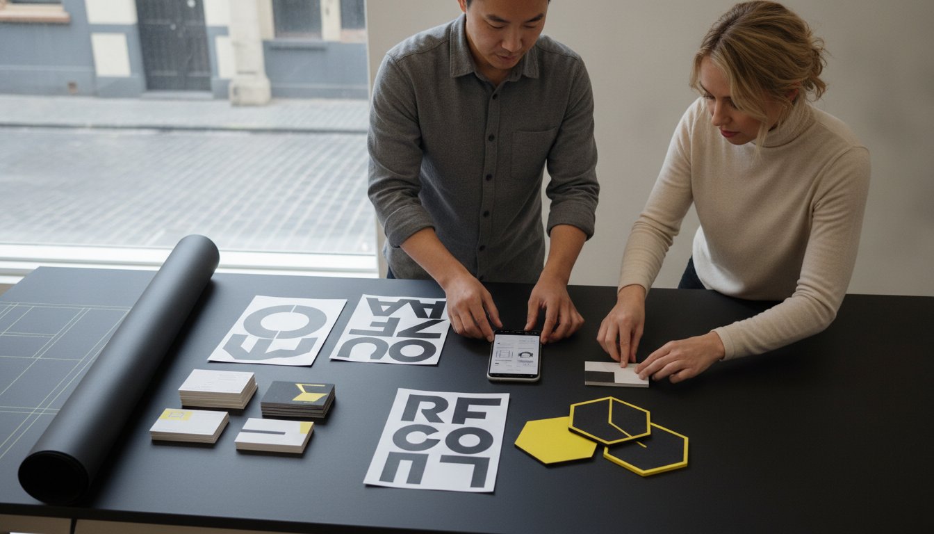
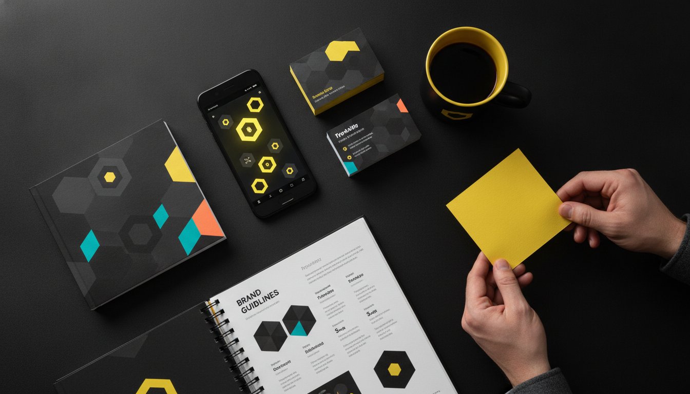
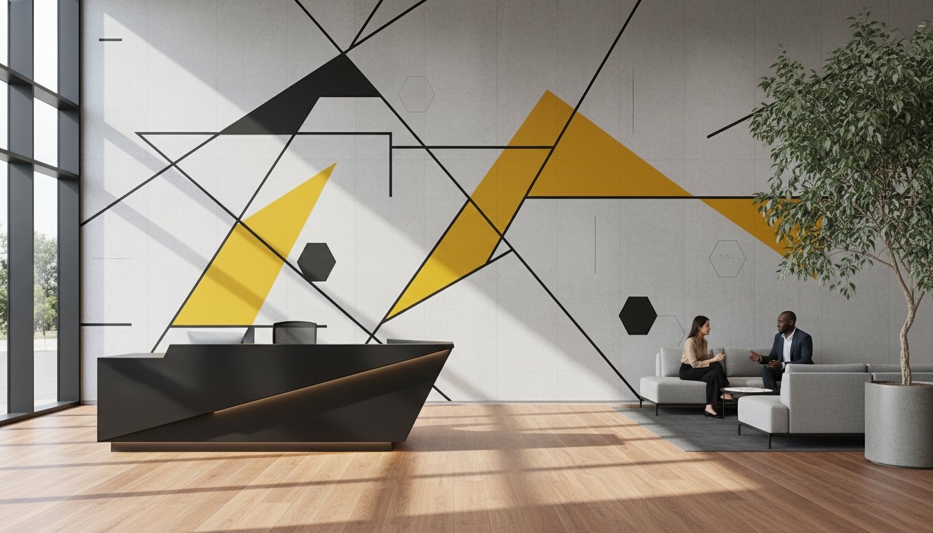
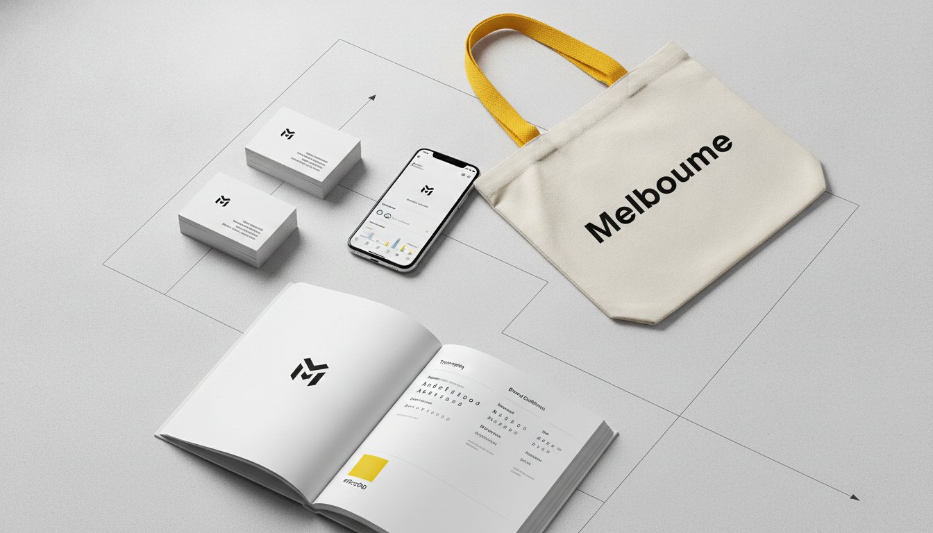
A logo cannot be everywhere. On a detailed service page, a complex report, or even within environmental graphics and signage, your typography carries the weight of your brand message. For Australian businesses, using a consistent typographic system creates a cohesive, bespoke feel that sets you apart from competitors using generic templates. It transforms every touchpoint into a brand-building opportunity. Whether it is on packaging design or a digital interface, type creates the atmosphere. Over time, this consistency builds a deep sense of trust and recognition. When your audience sees your specific type treatment, they should instantly recognise your brand's presence without needing to see a logo or a brand mark.
Human cognition is incredibly fast. We judge a brand's credibility in milliseconds. Professional type choices signal business stability and attention to detail, whereas poor choices can make a high-end consultancy look like a backyard operation. Typographic personality is the intersection of form and function where the visual style of a letterform meets its practical readability. This split-second perception is why typography in branding is the foundation of your visual identity. It bridges the gap between what you say and how your audience feels about your message. Choosing the right letterforms ensures your brand’s first impression is one of authority and confidence, establishing a connection that lasts well beyond the initial glance.
Every letterform carries a distinct emotional weight. Your audience's brain decodes these shapes in a heartbeat, often before they've even processed the literal meaning of the words. This is why typography in branding is such a potent psychological tool. It bypasses logic and speaks directly to the subconscious. Rounder, softer shapes naturally feel approachable and warm. Sharp, angular lines project precision and uncompromising authority. Understanding this spectrum is the first step in moving from an accidental brand to an intentional one.
The distinction between "boutique" and "corporate" often lies in the geometry of the type. Corporate identities frequently rely on rigid, symmetrical structures. These imply scale, stability, and a sense of permanence. Boutique brands, however, often favour organic, varied strokes that suggest a human touch and bespoke craftsmanship. Building Strategic Typographic Systems means aligning these psychological cues with your business objectives. It's about ensuring your visual voice matches the promise you make to your clients. Aligning these psychological cues with your Brand Strategy ensures your visual voice is both intentional and effective.
Serif typefaces, characterised by the small decorative "feet" at the ends of strokes, establish an immediate sense of heritage. They project reliability and academic authority. They are the go-to choice for established firms looking to convey trust. On the other hand, sans serif faces project clarity and innovation. They are the hallmark of the forward-thinking Australian tech scene and creative industries. Choosing the right typography in branding isn't just a matter of taste; it’s about meeting your target audience’s expectations of your industry.
Script fonts inject elegance and a personal, hand-crafted touch. They are perfect for boutique brands that want to feel intimate and high-end. Slab serifs are their bold cousins, communicating confidence and punchy impact. They work exceptionally well for industrial sectors or brands that need to command immediate attention. Finally, display type uses unique, often experimental letterforms to create a memorable visual hook. Use these for headlines or marketing assets to ensure your message sticks. Each choice adds a layer of character that helps your brand stand out in a crowded market.
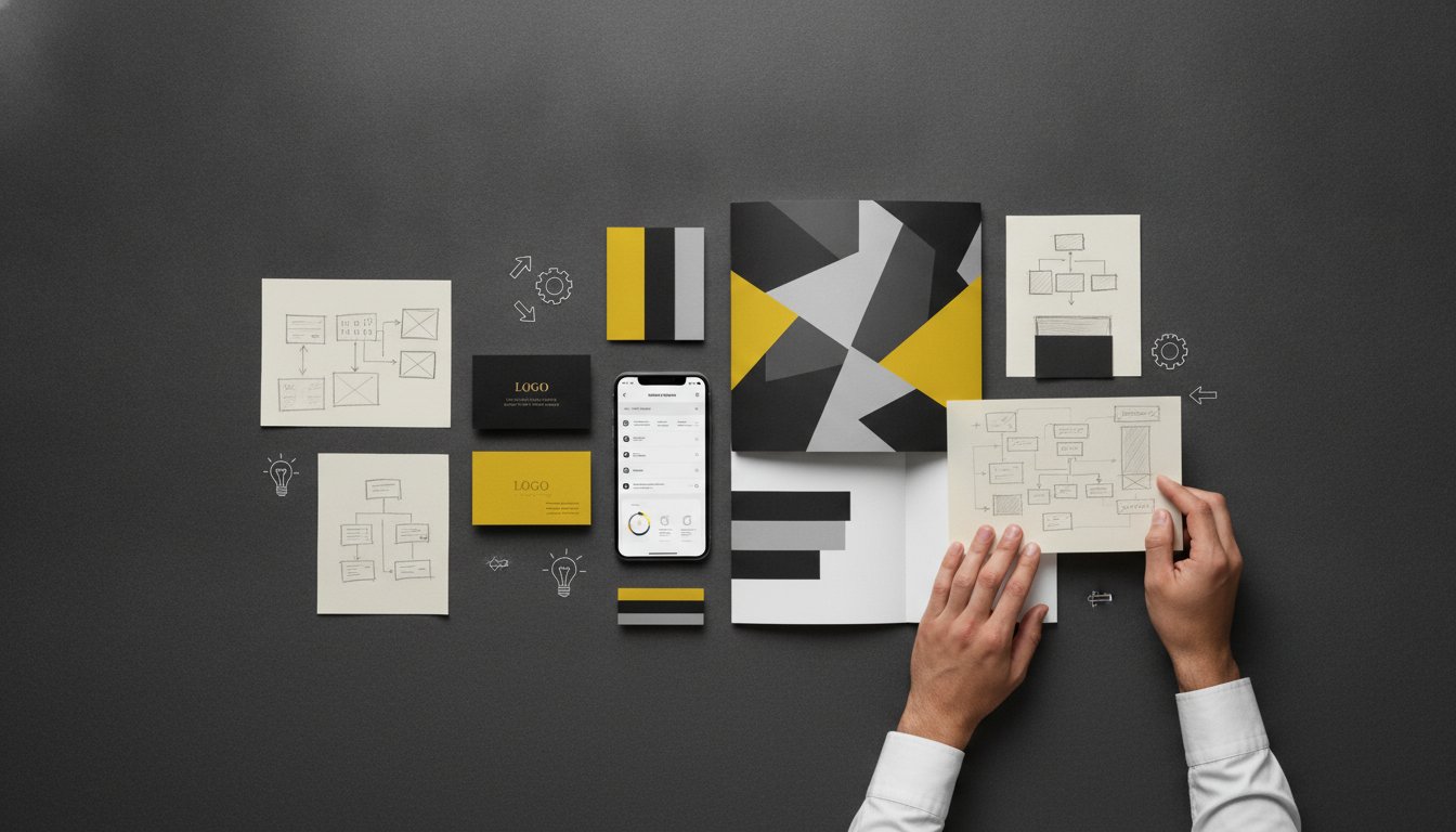
Effective typography in branding relies on restraint. We often advocate for the "Rule of Two". Using more than two distinct font families usually leads to visual clutter. It confuses the eye. It dilutes the message. By limiting your palette, you create a cleaner, more professional aesthetic that resonates with clarity. This isn't about being boring; it’s about being precise. A balanced system allows your primary typeface to shine while your secondary font does the heavy lifting. This simplicity ensures your brand remains recognisable across every medium.
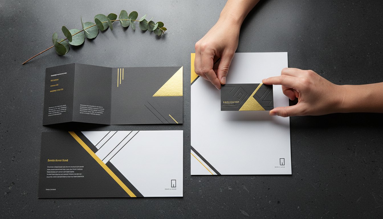
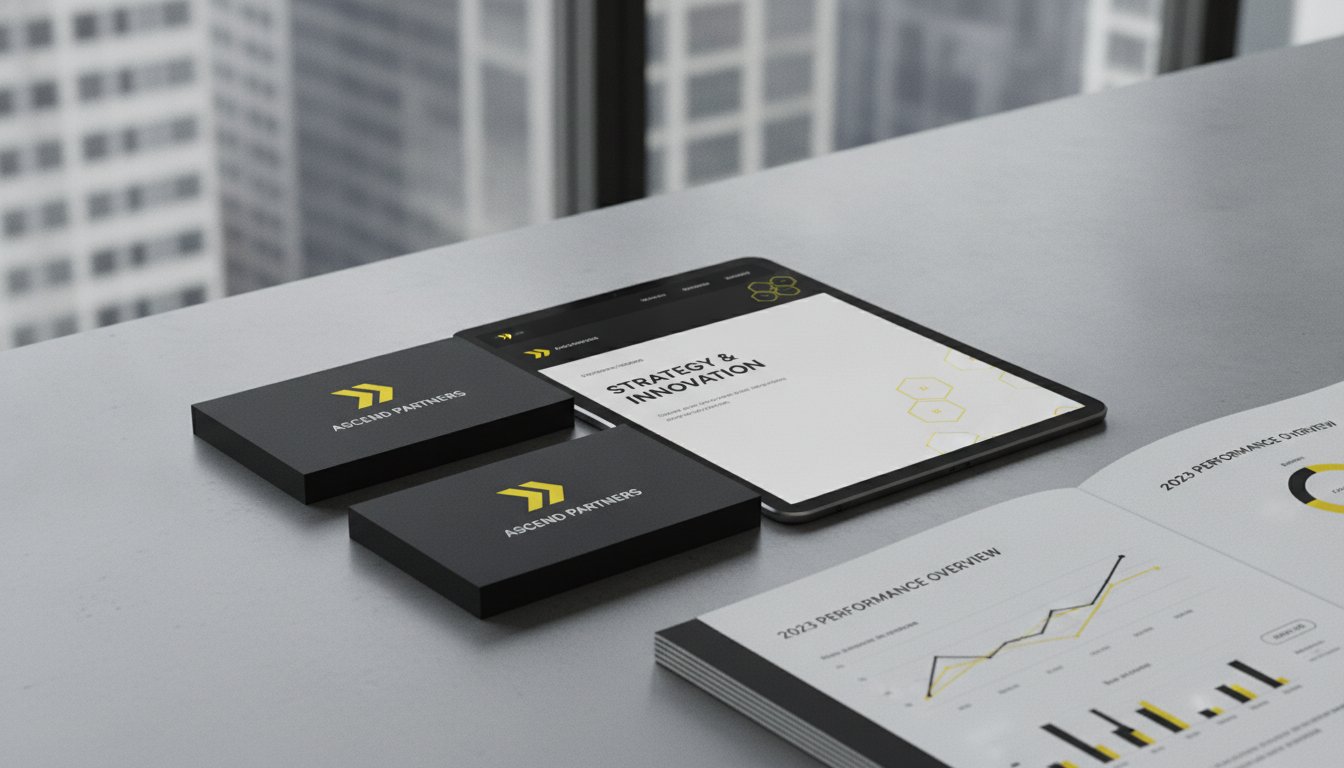
Contrast is your greatest ally in design. Pair a bold, high-impact heading with a clean, legible body font to create instant energy. This distinction doesn't just look good; it functions. It tells the reader where to look first. Whether you are developing Website Design & Development or creating physical packaging design, this balance ensures your brand feels cohesive. Consistency is the bridge between a one-off interaction and long-term brand loyalty. When your typography remains stable from business cards to environmental graphics, you signal reliability to your audience.
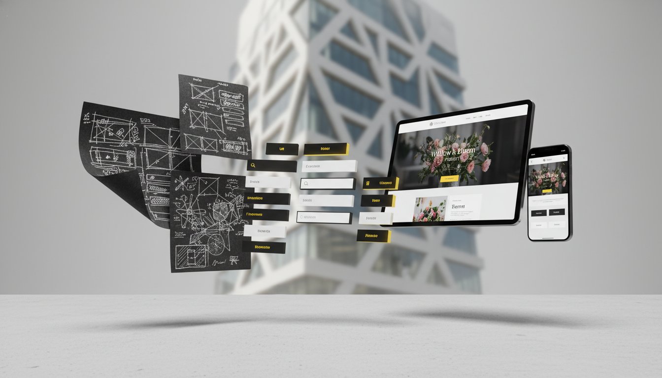
Establishing a clear hierarchy is essential for a structured reading experience. You must define specific styles for your H1, H2, and body text to guide the reader through your narrative. Use weight and scale to signal importance and organise information effectively. A large, heavy heading captures attention, while a well-spaced body font encourages deep reading. Hierarchy is the map of your brand's communication. It ensures your most vital messages are never lost in a sea of text. This logical flow respects the reader's time and improves engagement.
Successful pairing is about finding the right chemistry between letterforms. You want complementary styles, not conflicting ones. Avoid pairing two fonts that are too similar, as this creates visual "vibration" and looks like a mistake. Instead, pair a high-personality heading font with a "workhorse" secondary typeface. This secondary font should be highly versatile and legible at small sizes. This approach keeps your typography in branding clean, modern, and uncluttered. It allows for creative flair in your headlines while maintaining the absolute clarity required for professional business communication.
Digital environments are the primary battleground for modern brand recognition. Legibility is the most critical factor here. If your audience can't read your message quickly, they'll move on. Most Australians consume brand content on small mobile screens while on the go. Your typography in branding must be responsive. It needs to look as sharp on a smartphone as it does on a desktop monitor. This requires choosing typefaces with generous x-heights and open counters. These technical details ensure that letters don't "clog" or become indistinguishable at small sizes.
Performance matters just as much as aesthetics. Heavy font files increase loading times. A slow website frustrates users and hurts your search rankings. We recommend using high-performance fonts or curated collections from platforms like Google Fonts, which offers over 1,500 open-source families. This ensures your site loads fast without sacrificing your visual identity. Balancing beauty with speed is a hallmark of professional design. It respects the user's time and improves the overall experience.
Legibility refers to the clarity of individual characters. It's about whether a reader can distinguish a 'g' from a 'q' at a glance. Readability is different. It describes the ease with which large blocks of text are consumed. Your brand needs both to succeed. A high-personality font might be legible for a three-word headline, but it could be a disaster for a long blog post. We select typefaces that maintain their integrity across different scales. This dual focus ensures your message is both striking and easy to digest.
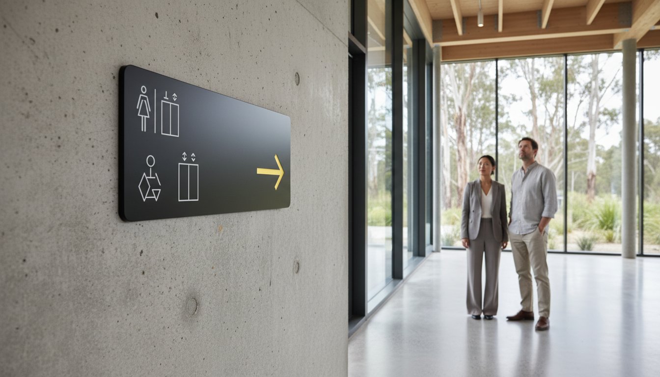
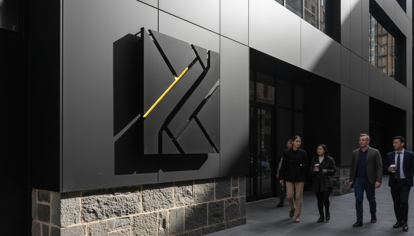
Inclusive design is no longer a choice; it's a standard. The Web Content Accessibility Guidelines (WCAG) 2.2, published on 5 October 2023, provide the current framework for digital accessibility. Meeting these standards involves ensuring high contrast ratios for vision-impaired users. Avoid over-stylised fonts for critical information and calls-to-action. This philosophy extends beyond the screen. Our work in Wayfinding signage design shows that accessibility is just as vital in physical spaces. Whether digital or physical, your type must serve every member of your audience.
Ready to ensure your digital presence is both beautiful and accessible? Let's talk about your Website Design & Development needs today.
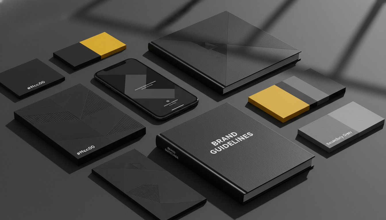
At Seamer Design, we don't treat typography as a decorative layer. We treat it as a strategic asset. Our approach integrates typography in branding directly into your broader Brand Strategy. This ensures every character, weight, and spacing choice serves a specific commercial purpose. We move your business beyond a basic logo. We build a comprehensive visual identity system that speaks with authority across every touchpoint. This level of intentionality is what separates a visionary brand from an amateur one.
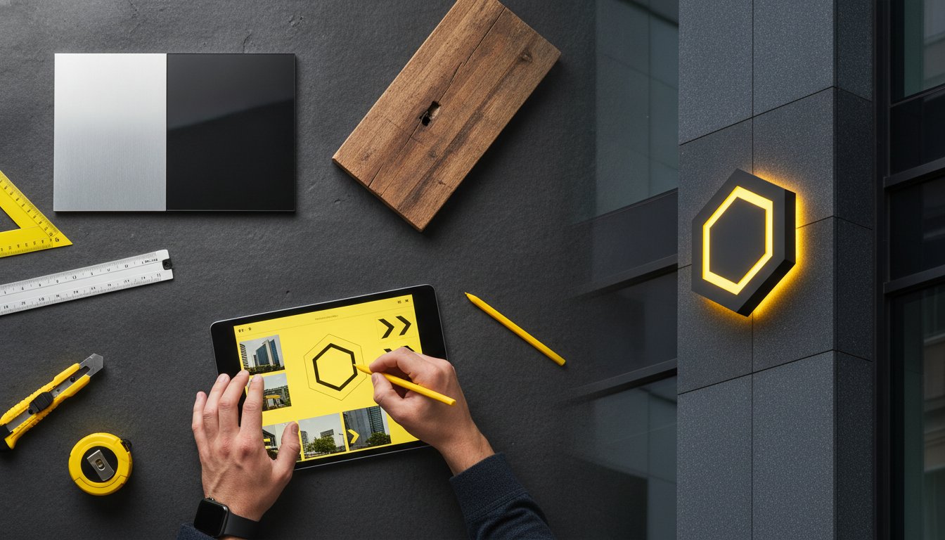
For businesses in Melbourne and Ballarat, the market is increasingly sophisticated. Standing out requires more than just following global trends. It requires a local perspective. A custom-curated typographic system provides a boutique advantage that off-the-shelf templates cannot match. It signals a level of care and precision that resonates deeply with Australian consumers. We look at how your type performs in the real world. This includes everything from your digital interface to your physical Environmental Graphics & Signage.
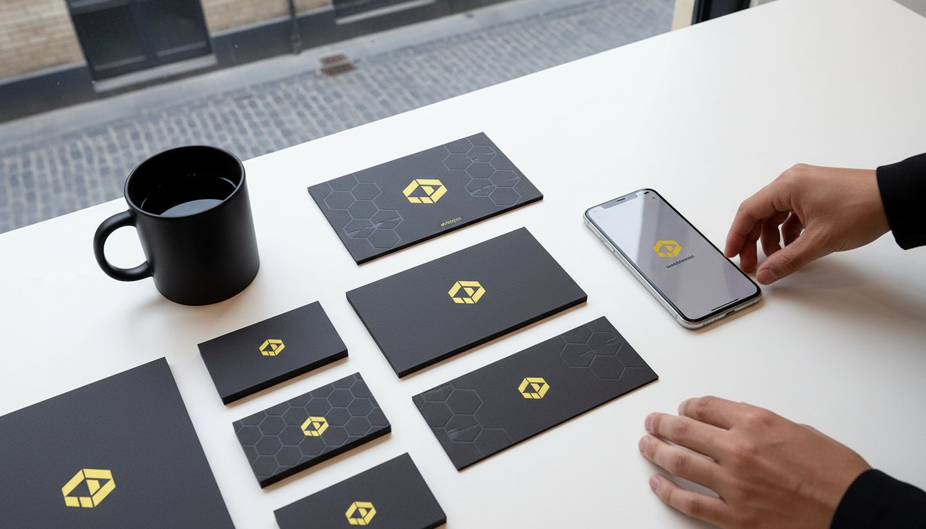
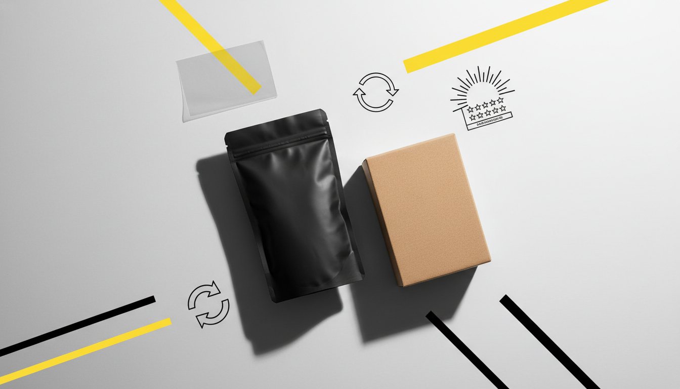
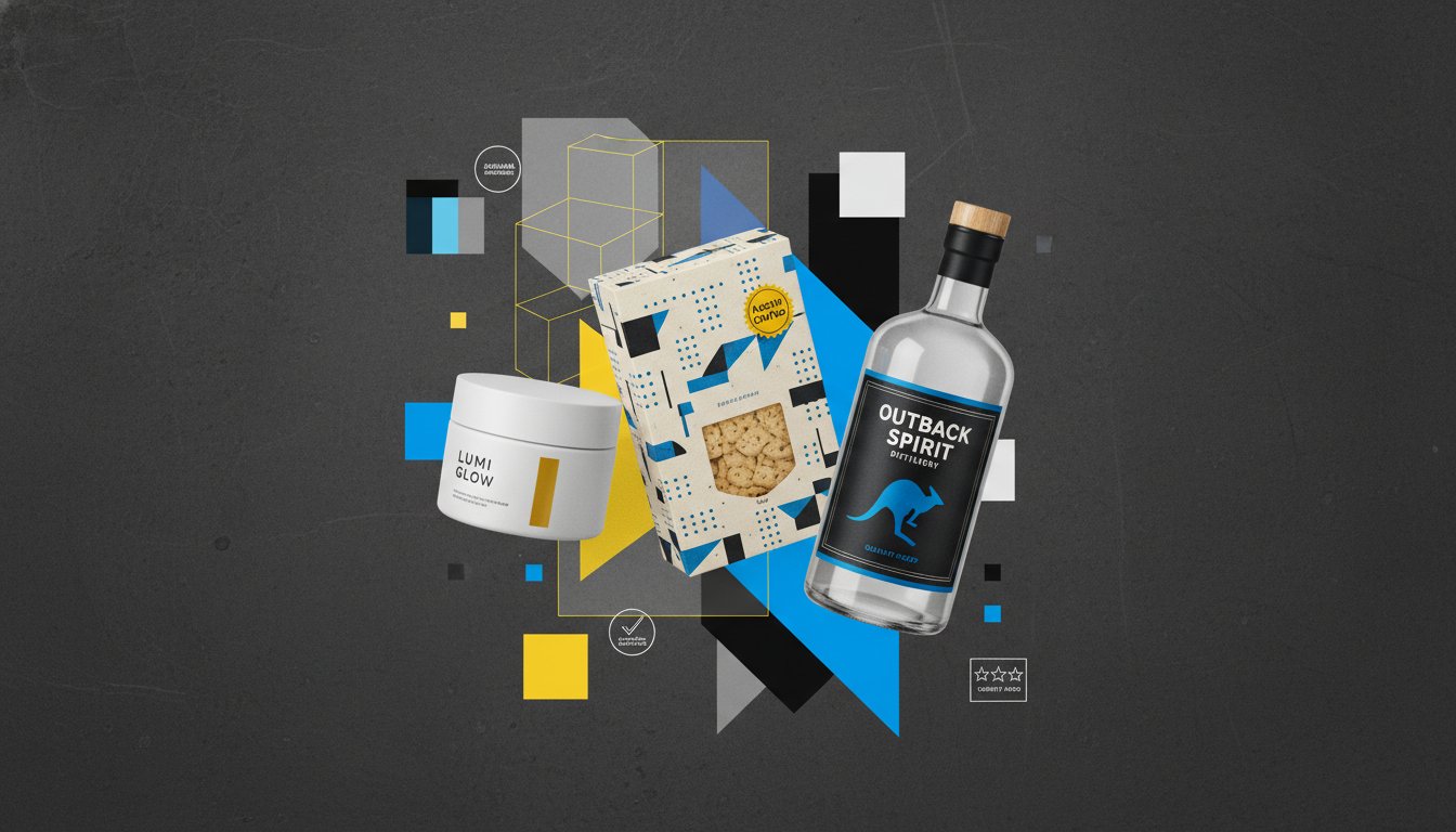
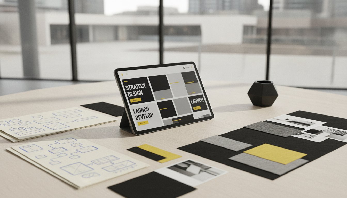
Our collaborative process aligns our creative vision with your strategic business goals. We act as your strategic partner, not just a service provider. We select type that reflects the unique landscape of your specific industry. Every character choice is deliberate. This intentionality bridges the gap between where your brand sits today and its desired future state. We focus on the transformative potential of design. We help you move from being a participant in your market to being a leader. Our work in Packaging Design and print media ensures your visual voice remains consistent and powerful across all physical formats.
A professional creative engagement is transformative. It's the key to an elevated brand experience. Whether you need a fresh Visual Identity Design or a complete overhaul of your Graphic Design for Print, we focus on outcomes. A typographic refresh can breathe new life into an established organisation. It signals evolution. It demonstrates growth. It tells your clients that you are forward-thinking and committed to quality. This investment in typography in branding pays dividends in long-term brand equity and customer trust.
Your visual voice is your most consistent ambassador. Don't leave it to chance. Professional design is a long-term investment in your business's perceived value. It builds recognition. It drives connection. It empowers your business to reach its full potential. We are ready to guide you through this creative process with confidence and clarity.
Let's elevate your brand's visual voice together.
Typography is the silent engine of your business identity. It dictates authority, builds trust, and ensures your message remains accessible across every digital platform. By mastering the psychology of letterforms and the art of strategic pairing, you move beyond mere aesthetics to create a lasting emotional connection. Effective typography in branding ensures your business speaks with clarity and purpose, even before a single word is read.
Elevating your brand requires more than a standard template. It demands a bespoke, design-led philosophy that aligns with your specific commercial goals. With over two decades of experience serving businesses in Melbourne and Ballarat, our collaborative team of strategists and creatives is here to guide you through the transformative potential of professional design. We bridge the gap between your current identity and a visionary future. It's time to let your visual voice be heard.
Ready to find your brand's unique visual voice? Partner with Seamer Design today.
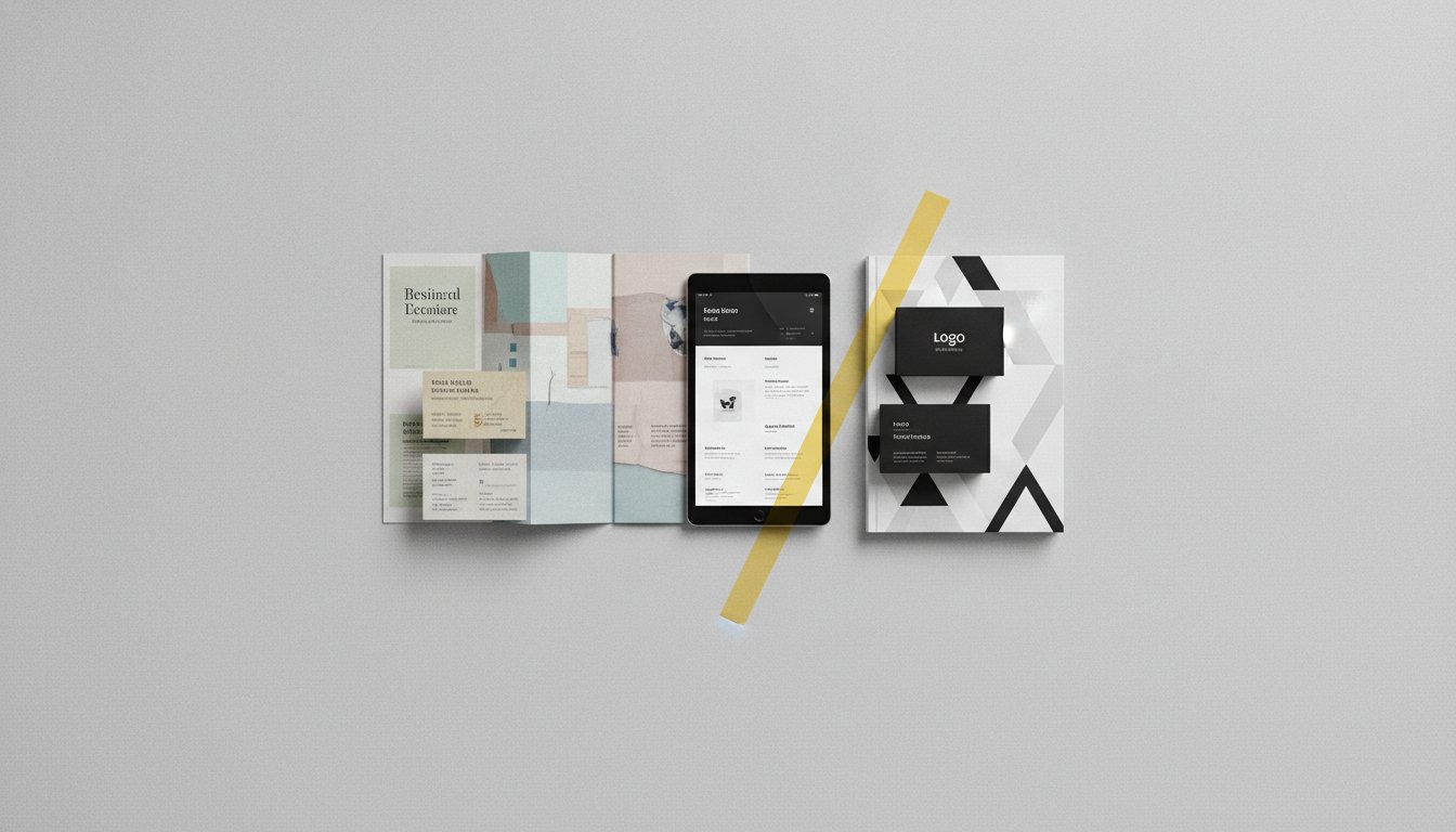
A typeface is the creative design of the letterforms, while a font is the technical file used to display them. Think of the typeface as the overarching artistic vision. The font is the delivery tool. This distinction is crucial when developing a visual identity design that remains consistent across both print and digital platforms.
Stick to the "Rule of Two" for most brand identities. Use one primary typeface for headlines to establish your brand's personality. Pair it with a secondary, highly legible font for body copy. This creates a clear hierarchy and prevents your marketing materials from looking cluttered or confusing to your audience.
Yes. Google Fonts provides over 1,500 font families under open-source licenses, making them a brilliant choice for professional branding. They are engineered for high performance on the web. This ensures your site loads quickly while maintaining a sophisticated look that doesn't require expensive annual licensing fees.
Typography is the foundation of digital navigation. It guides the user's eye and makes information easy to digest. Poor type choices increase cognitive load and drive users away. High-quality typography in branding improves accessibility and ensures your website design & development projects deliver a seamless experience on every screen size.
Luxury brands often favour high-contrast serifs or ultra-minimalist sans-serifs with generous letter spacing. These choices evoke a sense of heritage, exclusivity, and quiet confidence. The goal is to project a "less is more" philosophy. This aligns with the expectations of high-end consumers who value bespoke craftsmanship over loud, cluttered design.
Consistency builds trust. In the Australian market, a distinct typographic voice helps your business feel established and professional. It separates "local champions" from amateur operations. Using a consistent system across environmental graphics & signage and digital touchpoints ensures your brand is instantly recognisable to your local community.
Kerning is the process of adjusting the space between individual letters to achieve a balanced, visually pleasing result. It matters because even the best typeface can look broken if the spacing is off. In a logo, precise kerning signals a high level of attention to detail and professional polish that builds immediate credibility.
A custom typeface is a powerful investment for established businesses seeking total uniqueness. It eliminates the risk of sharing your visual voice with a competitor. While professional font styles on MyFonts often cost between $35 and $70 per style, a custom typeface offers a proprietary asset. It simplifies your typography in branding strategy by creating a signature look you own forever.


.jpg)
.jpg)
%20(1).jpg)